False breakouts and trend exhaustion — the reversal everyone else takes late
The last three rules in our course’s price-action set are the ones that look like folk wisdom: fade the failed break, trade with the trend, watch the trendline. Two of them appear to contradict each other, and the third is quoted so often that almost nobody checks what it actually claims. This lesson takes all three at face value, puts the course’s own charts under them, and then measures the thing that decides whether any of it is worth doing — first on a random series where nobody is trying to make breaks fail, then on six and a half years of real BTC, ETH and SOL four-hour candles — and prices a failed break in R once the stop has a place to sit.
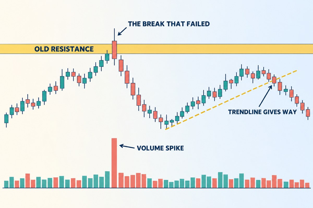
The three rules in one frame: a break that closes back inside, the volume that came with it, and a trendline giving way on the right. Schematic only — every measured claim below sits either on one of the course’s real screenshots or on a chart drawn to its own price scale.
KEY TAKEAWAYS
- Failed breaks are the norm, and they need no villain. On 400,000 simulated bars with no participants at all, 75.7% of breaks above a 50-bar high closed back inside within five bars. On real BTC, ETH and SOL four-hour charts (2020–Sep 2026, 1,467 breaks of a 50-bar high or low) the figure was 71.4%, and 68.4% for upside breaks alone — lower than the 75.4% the same candles give when shuffled. Real breaks held slightly more often, not less.
- The fade is priced by one division: R = range height ÷ overshoot. A $600 range poked by $60 is a 10R trade before buffers. So a deeper sweep is a worse trade, because your stop must sit above the spike. On real charts 80% of failed breaks overshot by less than one average candle — the zone where the stop is inside a single bar’s noise.
- Fading a failed break, on its own, broke even. Across 1,041 real fades: +0.00R per trade before fees, −0.07R after a 0.1% round trip. Chasing the break did a little better (+0.20R before fees, +0.09R after) — the mirror image of breaks holding more often than chance.
- That is why rule 7 exists. Fades taken with the bigger trend returned +0.29R after fees (204 trades); fades against it, −0.16R (837). The same split on shuffled candles shows no gap. The gap is in the direction the course predicts, but too few trades to call settled — and BTC alone did not show it.
- A rising trendline breaks on schedule, not on news. A market that fell not one dollar still crossed the line in a median of 4.2 bars across 3,240 real BTC, ETH and SOL lines (4.3 on the random series). The steeper you draw it, the sooner it “warns” you.
- Exhaustion comes first, the break second. Our course reads the reversal from two highs where the second is barely above the first and buying has thinned — the trendline break only confirms it.
What are the last three price-action rules?
They are rules 6, 7 and 8 of the eight strategy statements our course groups under Price action trading strategies. Lesson 37 priced the first five; these are the remaining three, in the course’s words:
| # | Rule, as the course states it | What it is really about |
|---|---|---|
| 6 | A false breakout is one of the best chances to trade the other way | Where the stop can sit. A failed high is a price the market has just refused, so it is the cheapest stop on the chart. |
| 7 | Trading with the trend returns more | How far the target can be. Legs that run with the trend are longer than the ones that run against it. |
| 8 | A trend shows it is ending when it breaks the trendline | When to stop assuming. A confirmation, not a cause — and one with a false-alarm mechanism built into it. |
Read together they say something narrower and more useful than any of them says alone: the failed break gives you the shape of a trade, the bigger trend gives you the reason to take it, and the trendline tells you when the reason has expired. The rest of this lesson tests each claim with a number.
Why do so many breakouts fail — is it really stop hunting?
Most write-ups answer this with intent: large players push price through an obvious level to trigger the stops resting above it, then sell into the buyers who arrived. That story is not wrong — but it cannot be the whole answer, because failed breaks happen at exactly the same rate on a series where there is nobody to do the hunting.
Here is the measurement. We generated 400,000 bars of a driftless random walk at 0.4% per bar, built each bar out of 40 sub-steps so it has real highs and lows, and then found every bar whose high exceeded the highest high of the previous 50 bars — 7,642 first touches in all. Then we asked how quickly price closed back below that old high.
| The break closed back inside the range… | Share of 7,642 breaks |
|---|---|
| in the breakout bar itself | 42.7% |
| within 3 bars | 68.8% |
| within 5 bars | 75.7% |
| still outside after 5 bars | 24.3% |
Three-quarters of them failed, and the series has no order book, no stops, no participants and no memory. The reason is definitional rather than behavioural: a fifty-bar high is, by construction, the most extreme price of a recent sample, so the next print is far more likely to be lower than higher. Any level you define as “the furthest price has got recently” inherits that property.
This does not mean stop hunting is a myth. It means the baseline is high, so the interesting quantity is the excess — how much more often real markets fail at a level than a structureless series does, and where. That is a much harder claim to make than “the market hunts stops,” and it is the honest version. What the baseline does settle is that you should not treat a failed break as evidence of anything about intent. It is simply the most common thing that happens at a fresh extreme.
Our course shows the behavioural version on a real chart, and it is worth reading for the sequence rather than the accusation: price nudges through an old resistance with a volume spike, buyers arrive, and price is back below the level almost immediately.

What happens on real charts?
The simulation sets a floor, and the lesson used to stop there. So we ran the same definition on real candles: every closed four-hour bar of BTC, ETH and SOL on Binance spot to 26 September 2026 — BTC and ETH from January 2020, SOL from its listing in August 2020, 13,400–14,800 bars per coin. A break is still the first bar whose high clears the highest high of the previous 50 bars (and, mirrored, the first low under the lowest low); a failure is still a close back inside within five bars. As a control we shuffled each coin’s candles twenty times — every candle keeps its shape and volume, the order between them is destroyed.
| The break closed back inside… | Random walk (7,642 breaks) | Real BTC, ETH, SOL 4H (1,467 breaks) | Same candles shuffled (33,077) |
|---|---|---|---|
| in the breakout bar itself | 42.7% | 46.5% | 55.3% |
| within 3 bars | 68.8% | 64.7% | 69.9% |
| within 5 bars | 75.7% | 71.4% | 75.4% |
Each coin on its own: BTC 73.3%, ETH 69.2%, SOL 71.5% within five bars; upside breaks alone, all three coins, 68.4%. Script do-so-bai-38-thuc-do.py, candles frozen on 26 September 2026.
Two things come out of that table. First, the baseline survives contact with real data: roughly seven breaks in ten fail within five bars on real charts too, so a failed break is still the ordinary outcome, not a rare tell. Second, and against the stop-hunting story, real breaks failed less often than shuffled ones — 71.4% against 75.4%, and in the breakout bar itself 46.5% against 55.3%. If large players were systematically pushing price through fresh extremes to trap buyers, real charts should show more failures than a series with no players in it. On these coins, at this timeframe, they show fewer. What the order of real candles adds is a little momentum, not a trap.
The volume spike in the course’s screenshot deserves the same check, because it is the detail most people remember. Splitting the real breaks into thirds by the breakout bar’s volume against its 20-bar average, the quiet third failed 85.7% of the time and the loud third 57.3%; breaks on three times average volume or more failed 54.9% of the time (293 breaks), against 69.7% for the same volume on shuffled candles. A volume spike on the break is not the mark of a trap — on average it is the mark of a break more likely to hold. What made the course’s example a trade was not the spike; it was the close back inside that came after it.
What is a failed break actually worth?
This is the part the folklore skips. A failed break is not valuable because it is a reliable reversal — it is valuable because it hands you a stop with an address. The high that just failed is a price the market visited and rejected inside a couple of bars, so a stop just above it is both structurally justified and, usually, very close.
That gives an identity worth memorising. Ignore buffers for a second and suppose you enter exactly at the broken level, stop exactly at the spike high, and target the far side of the range. Then:
R = range height ÷ overshoot (h ÷ x)
Both the account size and the percentage you risk cancel out; only two distances on the chart matter. And the identity has a consequence that runs against almost everything written about liquidity sweeps: the further past the level price got before it failed, the worse the trade, because your stop has to follow the spike upwards while the target stays where it was.
| Overshoot beyond the level | In average candles | R = $600 ÷ overshoot | Break-even win rate |
|---|---|---|---|
| $30 | 0.5 | 20.0R | 4.8% |
| $60 | 1.0 | 10.0R | 9.1% |
| $120 | 2.1 | 5.0R | 16.7% |
| $180 | 3.1 | 3.33R | 23.1% |
| $300 | 5.2 | 2.0R | 33.3% |
| $600 | 10.3 | 1.0R | 50.0% |
A fixed, hypothetical $600 range on a chart whose average candle is $58, so “candles” here means multiples of that. Break-even is 1 ÷ (R + 1).
Doubling the overshoot from $60 to $120 is not a stronger signal you can ignore the price of — it demands the trade win 16.7% of the time instead of 9.1%, 7.6 percentage points more, to stay level. If you believe a deeper sweep really is a better signal, that is the size of the belief you are taking on. And the other end of the table has its own trap: an overshoot under one average candle produces a beautiful R, but the stop is then inside the noise of a single bar, which is the condition Lesson 36 warned about — a stop narrower than one candle is not really a stop.
Here is the same idea on a real chart. We pulled every failed break on the BTC/USDT four-hour chart and picked this one because the whole trade fits on one screen. It also happens to be a winner — which is exactly why, on its own, it proves nothing. On 31 March 2024 at 20:00 UTC BTC printed a high of 71,366; three days later it bottomed at 64,493. That is the range: $6,873 tall, 6.3 average candles of $1,096. On 8 April at 08:00 the break came on a candle closing at 72,404 with four times its 20-bar average volume, the next candle reached 72,798 — an overshoot of $1,432, 1.3 candles — and four candles later, at 00:00 on 9 April, BTC closed back inside at 71,285.

Notice what supplies each half of that trade. The stop is a price that has just demonstrated, in public, that it could not hold — and it is $1,513 away, under one and a half average candles. The target is not a projection; it is the low that defined the range before any of this happened. Very few setups give you both ends from something already visible. The identity also holds up: $6,873 ÷ $1,432 is 4.8R at the level itself, and entering at the close back inside, $81 lower, trims it to 4.49R.
Where does that example sit among real failed breaks? Lower than most on R, because its overshoot was large. Across the three coins the median failed break overshot by only 0.42 of an average candle, and 80% of them overshot by less than one candle; the median fade was worth 6.65R on paper. In other words, most real failed breaks sit at the beautiful-R, stop-inside-the-noise end of the table above. That is not a reason to love them; it is the reason the next section’s numbers come out the way they do.
PRACTICE CORNER
Do this once and the identity in this section stops being algebra. Open a chart you follow, find a level that price has tested more than once, and scroll forward to the first bar whose high went above it. Write down three numbers before you form any opinion: the height of the range under the level, the distance price got above it before the first close back inside, and the two divided into each other. That third number is the R the trade was offering — and if you repeat it on ten breaks, you will see the spread for yourself: some offer 15R, some offer 2R, and the difference is almost entirely the overshoot, not how convincing the candle looked. Then do the harder half: count how many of those ten closed back inside within five bars, and compare it with the 75.7% baseline from Section 2. Anything close to it means the level you chose is telling you nothing that a fifty-bar high would not.
You need bar-by-bar inspection and a chart where you can measure two distances precisely. Our live chart does both and needs no account — the short-position tool (key P) draws the box in the screenshot above. If you want a full charting package, or an exchange for when you are ready to place real orders, these are the ones this site uses:
We may earn a commission if you open an account through these links, at no cost to you. It does not change what is written above.
Fade it or chase it — which is the better trade at the same level?
Two people watch the same break. One buys it, expecting continuation. The other waits for the close back inside and sells. They are looking at the same three candles. The natural question is which of them has the better trade, and the answer is more interesting than either camp usually admits: neither.
Take the same April 2024 break. The chaser buys the close of the breakout candle at 72,404, puts the stop under that candle’s low at 70,642, and targets a measured move of one range height above the level: 71,366 + 6,873 = 79,277. The fader takes the trade from the last section.
| Trade at the same level | Entry | Stop | Risk | Target | Reward | R | Break-even |
|---|---|---|---|---|---|---|---|
| Fade the failed break | 71,285 | 72,798 | $1,513 | 64,493 | $6,792 | 4.49R | 18.2% |
| Chase the break | 72,404 | 70,642 | $1,762 | 79,277 | $6,873 | 3.90R | 20.4% |
Here the fade had the better R and won, while the chase was stopped out on the candle after the close back inside. Do not read anything into that. In the hypothetical we used when this lesson was first written (a $600 range poked by $60), the chase had the better R, 7.09 against 5.32, and nothing about the arithmetic favours either side in general. One trade picks a winner by luck. What separates the two rules is what they do over hundreds of breaks. On the random series, run mechanically — fade at every close back inside, chase at every breakout bar’s close — this is what came out:
| Rule applied 5,000+ times | Median R | Target hit first | Break-even it needed | Expectancy |
|---|---|---|---|---|
| Fade (n = 5,786) | 8.39 | 12.94% | 12.23% | +0.09R |
| Chase (n = 7,412) | 7.40 | 13.34% | 12.37% | +0.10R |
Both land on top of their own break-even, and they were always going to. On a series with no trend, the probability of reaching a target before a stop is fixed by the distances alone — P(lower barrier first) = (stop − entry) ÷ (stop − target) — so expectancy is exactly zero whatever pattern you use to pick the entry. The residual tenth of an R is measurement, not edge: at a coarser 10 sub-steps per bar it inflates to +0.17R and +0.28R, and it shrinks as the bars get finer, because a stop sitting 0.3 candles away is decided by the path inside the bar rather than by anything you can see.
Real markets are not driftless, so we ran both rules on the real candles too, with the same entries, stops and targets, resolved over the following 260 bars, before and after a 0.1% round-trip fee (two 0.05% taker fills, charged against each trade’s own risk):
| Real BTC, ETH, SOL 4H, 2020–2026 | Trades | Median R | Target hit first | Break-even it needed | Before fees | After fees (95% range) |
|---|---|---|---|---|---|---|
| Fade the failed break | 1,041 | 6.65 | 15.5% | 15.3% | +0.00R | −0.07R (−0.25 to +0.11) |
| Chase the break | 1,462 | 5.64 | 20.2% | 16.3% | +0.20R | +0.09R (−0.08 to +0.28) |
| Fade, same candles shuffled | 24,742 | 7.58 | 15.4% | 16.0% | −0.07R | −0.16R |
| Chase, same candles shuffled | 32,833 | 5.88 | 16.6% | 16.8% | −0.01R | −0.33R |
Upside and downside breaks together; the fade is short after a failed break of a high and long after a failed break of a low. Trades still open after 260 bars are left out. The 95% range is a bootstrap over trades. The fee costs the fade about 0.07R a trade because its median stop is only 1.9% from entry.
Three things are worth taking from it. The fade on its own was break-even before fees and slightly negative after them — exactly what the random walk predicted, so the geometry still buys you a shape, not an edge. The chase did better: +0.20R before fees, with a 95% range of +0.03 to +0.38 — the only figure in this lesson whose range stays above zero, until the fee pulls it back to −0.08 to +0.28 — and the same rule on shuffled candles shows nothing. That is the mirror image of the last section — real breaks held more often than chance, so buying them paid a little and fading them paid a little less. And fees matter more to the fade than to anything else here, because a stop that sits a fraction of a candle away turns a 0.1% fee into a large slice of 1R.
So on the random series the two trades are not distinguished by their odds, and on real charts only by a little. What does distinguish them is what each end rests on:
- The fade’s stop is an event — a price that failed. The chase’s stop is a bar’s low, which is a fact about one candle, not about the level.
- The fade’s target already exists on the chart. The chase’s target is a measured move you projected, and nothing on the chart has agreed to it.
- The fade’s reward is capped by the range; the chase’s is open-ended if the break is genuine.
That last line is the crack the next rule pushes into.
Rules 6 and 7 look contradictory. Are they?
Rule 6 says trade the other way; rule 7 says trade with the trend. Taken as slogans they cancel out. Taken as written they do not, because they answer different questions: rule 6 tells you where a trade is shaped, rule 7 tells you which of the two possible directions is worth taking. The section above is why you need the second one — if the pattern cannot supply an edge, something outside the pattern must.
Our course makes the case for rule 7 by measuring the legs on its own charts, which is the most direct evidence available: in a trend, the legs that run with it are simply longer than the ones that run against it.


Put the two rules together and the contradiction disappears into a single instruction: take the failed break that fails in the direction the larger timeframe is already going. A break upward that fails inside a market whose higher frame is falling is a with-trend entry wearing a counter-trend costume — you are selling into a decline, at the one price where the stop is cheap. The same failed break inside a rising market is a counter-trend trade with a capped target, and rule 7 says it pays less.
Deciding which way the larger frame leans is not this lesson’s job — it is the job of diagnosing trend or range and of making the frames agree. What this lesson adds is why that diagnosis is not optional: without it, the setup is a coin toss with good geometry.
Does the bigger-trend filter show up in real data?
It is one thing for the course to say it and another to see it in the numbers, so we split the 1,041 real fades by the simplest trend filter we could defend in one sentence. A fade counts as with the trend when it goes the same way as the 200-bar moving average on the four-hour chart (about 33 days): a short after a failed break of a high while price is below a falling average, or a long after a failed break of a low while price is above a rising one. Everything else counts as against it. Same entries, stops and targets as before, after fees:
| Real fades, after a 0.1% fee | Trades | Target hit first | Break-even it needed | Per trade | 95% range |
|---|---|---|---|---|---|
| With the 200-bar trend | 204 | 22.1% | 17.5% | +0.29R | −0.14 to +0.75 |
| Against it | 837 | 13.9% | 14.8% | −0.16R | −0.34 to +0.03 |
| With the trend, BTC only | 70 | 17.1% | 17.0% | −0.16R | −0.73 to +0.60 |
| With the trend, ETH only | 62 | 30.6% | 18.4% | +0.74R | −0.03 to +1.61 |
| With the trend, SOL only | 72 | 19.4% | 17.3% | +0.34R | −0.40 to +1.22 |
| With the trend, shuffled candles | 4,906 | 20.0% | 20.4% | −0.17R | −0.25 to −0.09 |
| Against it, shuffled candles | 19,836 | 14.2% | 14.9% | −0.15R | −0.20 to −0.11 |
The gap runs the way rule 7 says it should: about 0.45R a trade between fades that agreed with the bigger trend and fades that fought it, and it disappears on shuffled candles, where “trend” is just noise. That is the most direct support for the rule in this lesson. It is also thin. Only one failed break in five qualified, so the with-trend row rests on 204 trades and its 95% range still straddles zero; BTC on its own, with 70 such trades, came out negative; and a different filter (a 50-bar average, the daily chart) would move every number. Read it as “the filter pointed the right way on six years of three coins”, not as a measured edge you can bank. The sturdier half of the finding is the other row: the 837 fades against the trend lost 0.16R a trade, with a 95% range that only just reaches zero, and leaving them out is most of what the filter does.
There is one more warning worth carrying over from the way our own trading notes describe these moments. Failed breaks cluster at the end of a long, narrowing range — the point at which every lower timeframe has gone quiet and the crowd has been worn down by a fortnight of small hopes. In that state a single sharp bar flips every short-term reading to “agreement” at once, which looks overwhelming on screen but is a mechanical consequence of everything sitting mid-scale rather than evidence of real buying. The blunt version: a level that has not been broken is still in force, however fast price is moving toward it.
When does a broken trendline mean the trend is over?
Less often than the rule sounds, and the reason is arithmetic rather than psychology. A horizontal level stays where you put it. A rising trendline does not: it climbs toward price every bar, so it can be “broken” by a market that does nothing at all.
Put a number on it. If price sits a distance d above the line and the line rises by s per bar, a perfectly flat market crosses it in d ÷ s bars. On the same series as before we drew every rising line through two consecutive swing lows — 24,786 of them, median slope 0.143 average candles per bar — and computed that number for each.
| How steeply the line rises | Bars a completely flat market survives | Lines |
|---|---|---|
| under 0.1 candles per bar | 13.3 | 9,022 |
| 0.1 – 0.2 | 4.2 | 7,207 |
| 0.2 – 0.4 | 2.2 | 7,260 |
| over 0.4 candles per bar | 1.3 | 1,297 |
| All rising lines | 4.3 (25th–75th percentile: 2.1–9.7) | 24,786 |
Swing lows defined as a low with two lower lows on each side; the convention matters, and a looser one changes the answer (one bar each side gives a median of 3.0 bars, three bars each side gives 5.1). 55.6% of these lines were crossed within five flat bars and 75.6% within ten.
The real charts give the same answer. Drawing every rising line through consecutive swing lows on the BTC, ETH and SOL four-hour charts, same convention, gives 3,240 lines with a median slope of 0.119 average candles per bar; a flat market would have crossed the median one in 4.2 bars (25th–75th percentile 2.0–9.7), and 56.1% within five bars. Shuffled candles: 4.4 bars and 53.7%. By slope: 9.8 bars under 0.1 candles per bar, 3.2 between 0.1 and 0.2, 2.1 between 0.2 and 0.4, 1.6 above 0.4. The fuse is a property of geometry, and real markets inherit it unchanged.
So more than half of the trendlines a chart generates are crossed within a working day’s worth of four-hour bars by a market that has not fallen a cent. The steeper you draw the line — which usually means the more excited the move you drew it under — the sooner it fires. The alarm you set went off because of how you set it.
This is a cousin of the finding in Lesson 37, where a gap between price and a moving average mostly closed because the average walked up to price. Same family, different lesson: there the moving threshold is generated by the data, so you cannot argue with it; here the threshold is a line you chose, and the fuse length was set the moment you picked which two lows to connect.

Which brings us to what our course actually says about rule 8, and it is more careful than the slogan. Reading a reversal, the course looks first at exhaustion: “price sets two highs with the second no longer far above the first, and buying has weakened a great deal.” Only then: “as soon as price breaks the first support of that uptrend, the reversal is officially confirmed.” Exhaustion first, break second. The break is the receipt, not the transaction — and if you never saw the exhaustion, the receipt may just be the line arriving.

When are these three rules wrong?
Every rule here has a stated condition, and saying it out loud is the difference between a method and a superstition.
- The baselines are averages over three coins on one timeframe. The 75.7% comes from a random walk; the 71.4% from BTC, ETH and SOL four-hour candles between 2020 and September 2026. Neither says what a one-hour altcoin chart or a stock will do, and neither says the next break will fail. Measure your own market before you borrow either number.
- The fade is worth nothing without context. On real charts it broke even before fees and lost 0.07R a trade after them. If you take the setup without a view on the larger trend, you have bought the geometry and skipped the edge — and the evidence that the trend filter supplies that edge rests on 204 trades, with BTC on its own not showing it.
- A tiny overshoot is a trap, not a gift — and it is the common case. Four in five real failed breaks overshot by less than one average candle. There the stop is inside a single bar’s noise, whether it is hit depends on tick-level path, and a 0.1% fee is a big slice of 1R. Widen it with a buffer — which lowers the R in the table — or pass.
- Rule 7 assumes there is a trend. In a genuine range there is no “with” direction, both sides are capped by the boundaries, and the leg-length argument evaporates. Diagnose first.
- The trendline numbers depend on the convention. Change how you define a swing low and the median flat-market survival moves between 3.0 and 5.1 bars. Quote the number without the convention and it is meaningless.
- None of this is a win rate for you. The hit rates above belong to mechanical rules on past candles, with entries, stops and targets defined to the cent. Our own course material describes these episodes as observation rather than a system with measurable odds; anyone quoting you a success rate for fading breakouts without showing the rule and the sample has measured something they have not shown you.
What are the most common mistakes?
| Mistake | What to do instead |
|---|---|
| Treating a deep sweep as a stronger signal | Price it. A deeper overshoot is a mechanically worse trade — $60 gives 10R, $120 gives 5R on the same range. |
| Reading the volume spike as the sign of a trap | Wait for the close back inside. On real charts, breaks on three times average volume failed less often (54.9%) than breaks on quiet volume; the spike is only part of the story once price has closed back in. |
| Calling a break “failed” while the bar is still open | Wait for a close back inside. A wick through a level that closes back in is the sweep case from Lesson 17; an open bar is neither yet. |
| Fading every failed break you see | Take the ones failing in the direction the higher frame is already going. On real BTC, ETH and SOL charts the fades against the 200-bar trend lost 0.16R a trade after fees; that filter is the whole of rule 7. |
| Putting the stop at the level instead of above the spike | The level was just proven porous. The spike high is what has been rejected — that is the price with information in it. |
| Reading a trendline break as a reversal on its own | Look for the exhaustion first: a second high barely above the first, and thinner participation. No exhaustion, no signal. |
| Redrawing the trendline steeper after a fast move | Understand what you are doing: a steeper line is a shorter fuse. Over 0.4 candles a bar, a flat market breaks it in 1.3 bars. |
| Sizing the trade off the tiny stop | A stop 0.4 candles away invites a huge position. Size from your risk budget, not from how close the stop happens to sit — see position sizing. |
What else do people ask?
Are false breakouts caused by stop hunting?
The frequency needs no villain. On a simulated random walk with no participants at all, 75.7% of breaks above a 50-bar high closed back inside within five bars. On real BTC, ETH and SOL four-hour charts from 2020 to September 2026 the figure was 71.4% across 1,467 breaks — lower than the 75.4% the same candles give when shuffled into random order. If deliberate stop hunting drove failures at fresh extremes, real charts should fail more often than a series with nobody in it; on these coins at this timeframe they failed less.
How do you price a false breakout trade?
Ignoring buffers, the reward-to-risk of fading a failed break is the range height divided by the overshoot: R = h / x. On a hypothetical $600 range broken by $60 that is 10R. That identity has an uncomfortable consequence — the deeper the sweep past the level, the worse the trade, because your stop has to sit above the spike. Doubling the overshoot from $60 to $120 cuts the trade from 10R to 5R and lifts the break-even win rate from 9.1% to 16.7%.
Is fading a breakout better than trading it?
Not by itself. On real BTC, ETH and SOL four-hour charts, fading every failed break of a 50-bar extreme returned +0.00R per trade before fees and −0.07R after a 0.1% round trip, across 1,041 trades; chasing the break returned +0.20R before fees and +0.09R after. The difference that mattered was direction: fades taken with the 200-bar trend returned +0.29R after fees (204 trades), fades against it −0.16R (837 trades). That gap matches the course’s rule about trading with the trend, but the sample is small and BTC alone did not show it.
Does breaking a trendline mean the trend is over?
Not on its own, because a rising trendline is a threshold that moves toward price whether or not price does anything. Across 3,240 rising lines drawn through consecutive swing lows on real BTC, ETH and SOL four-hour charts, a completely flat market would have crossed the median line in 4.2 bars, and 56.1% within five bars — the same as on a random series. The steeper the line, the shorter the fuse. Our course puts exhaustion first and the break second: the break confirms a loss of momentum you should already have seen.