Candlestick patterns — hammer, engulfing, doji, and how each one is actually traded
Most candlestick guides are catalogues. Forty shapes, forty names, a little drawing of each one, and an implied promise that recognising them is the skill. It is not. The shapes are easy and they are also the part that does the least work — you can learn every name on the list and still lose money on all of them, because naming a pattern tells you nothing about whether trading it is worth doing. This lesson does the other half. It turns the shape rules into numbers you can check, shows where the entry, stop and target actually go, and then does the arithmetic almost nobody does: what a pattern is worth once you account for the fact that the pattern itself decides how wide your stop has to be.
KEY TAKEAWAYS
- The stop goes at the pattern’s extreme, so pattern height is stop width. R:R = D÷h − 1 — and a pattern twice as tall costs you 62.5% of your reward-to-risk, not half.
- For a 2R trade the pattern must be no taller than a third of the distance to target. Four seconds of arithmetic that kills most textbook-looking setups.
- The “wick twice the body” rule just means the close finished 66.7% up the range, or CLV ≥ +0.33. The scale is compressed, so 1.8× versus 2.2× is an argument about 4.5 percentage points.
- Waiting for the confirmation candle cost 3.50R → 1.90R in this example, lifting the break-even win rate from 22.2% to 34.5%. It has to buy 12.3 points of win rate to pay for itself. On 288 real four-hour hammers it did not: as a filter it bought 5.4 points and raised the bar 5.8; as a delay on the same hammers it raised the bar 13.8 points and bought nothing.
- Measured, not assumed: on 1,057 real four-hour engulfings (BTC, ETH, SOL, 2020–2026) the tallest third priced at 0.89R against 1.91R for the shortest — but won 55.0% of the time against 40.6%, and every group finished within noise of zero. Pricing tells you the win rate you need. It does not supply it.
- A hammer and a hanging man are the same candle. Half of every pattern’s meaning is the trend it interrupted, and that half is not in the shape.
What is a candlestick pattern actually claiming?
That one side ran out of money at a specific price, and that you can see the moment it happened.
That is the whole idea, and it is worth saying plainly because the usual presentation buries it. A named pattern is not a magic shape. It is a compact record of a fight: price went somewhere, met opposition there, and came back. The name is just a label for a particular kind of fight. A hammer says sellers pushed hard and got overwhelmed at the low. A bearish engulfing says buyers were in control until one candle wiped out everything they had gained. A doji says both sides showed up and neither won.
Once you read them that way, three things follow, and each one saves you money.
Position matters more than shape. A hammer only means something at the bottom of a fall, because the claim it makes is sellers ran out, and sellers cannot run out if they never started. The identical candle in the middle of a range is a candle, not a signal. Diagnosing trend or range comes before pattern recognition, not after it.
The pattern is a claim about the last few hours, so it decays fast. Nobody is still trading off Tuesday's hammer on Friday. Whatever edge exists lives in the next handful of candles.
And the shape has to be measured, not admired. That is the next section, and it is where most of the value in this lesson sits.
What does “the wick must be twice the body” actually mean in numbers?
It means the close finished at least two thirds of the way back up the candle. The shape rule is a retracement threshold wearing a costume, and once you translate it, you can check a candle with arithmetic instead of with an opinion.
Take the strictest reading of a hammer — the version where the rule barely holds. The candle has no upper wick, a body of b, and a lower wick of w. Its total range is b + w, and the close sits w above the low. So the fraction of the range recovered by the close is simply w ÷ (b + w).
Lesson 10 introduced close location value, or CLV, which scores where a candle closed on a scale from −1 to +1. The wick ratio converts straight into it: CLV = (w − b) ÷ (b + w). Which means the famous 2:1 rule is nothing more mysterious than CLV ≥ +0.33.
| Wick : body | Where the close lands in the range | Same thing as CLV |
|---|---|---|
| 1 : 1 | 50.0% | 0.00 |
| 1.5 : 1 | 60.0% | +0.20 |
| 2 : 1 — the classic rule | 66.7% | +0.33 |
| 3 : 1 | 75.0% | +0.50 |
| 4 : 1 | 80.0% | +0.60 |
| 6 : 1 | 85.7% | +0.71 |
| 10 : 1 | 90.9% | +0.82 |
Now read the column of percentages downwards, because it contains something the shape rule hides. The wick-ratio scale is compressed, and it compresses fastest exactly where people argue hardest. Doubling your standard from 2:1 to 4:1 — which feels like being twice as strict — buys you 13.3 percentage points of extra recovery, from 66.7% to 80.0%. Doubling again, 4:1 to 8:1, buys only 8.9 more. Each doubling of the rule delivers less than the one before.
The practical consequence is worth pinning to your monitor. Squinting at a candle to decide whether the wick is 1.8× the body or 2.2× is an argument about 4.5 percentage points of recovery — 64.3% versus 68.75%. That is inside the noise of where the candle happened to close. Meanwhile the difference between a 2:1 wick and a 6:1 wick is 19 points, and you can see that one from across the room. Stop grading borderline patterns. Take the obvious ones and skip everything you had to measure twice.

Which patterns are worth learning, and what does each one claim?
Fewer than you have been shown. Most published lists run to forty or more; the ones below cover the situations that actually recur, and each row states the claim rather than just the shape.
| Pattern | The shape, as a rule | Where it must appear | What it claims |
|---|---|---|---|
| Hammer | Lower wick ≥ 2× body; body either colour | Bottom of a fall | Sellers pushed to a new low and were absorbed before the close |
| Hanging man | Same shape as the hammer | Top of a rise | Selling appeared inside a rising market for the first time |
| Shooting star | Upper wick ≥ 2× body; usually closes red | Top of a rise | Buyers made a new high and gave every cent of it back |
| Inverted hammer | Same shape as the shooting star | Bottom of a fall | Buyers tested upward and failed, but they were present at the low |
| Bullish engulfing | Candle 2's green body fully covers candle 1's red body | Bottom of a fall, market clearly trending | One candle erased the previous candle's whole result |
| Bearish engulfing | Candle 2's red body fully covers candle 1's green body | Top of a rise, market clearly trending | Same claim, other direction |
| Piercing line | Candle 2 closes past the midpoint of candle 1's body | Bottom of a fall | A weaker engulfing — half the damage undone, not all |
| Dark cloud cover | Candle 2 opens above candle 1's high, closes below its midpoint | Top of a rise | The breakout everyone bought was sold into immediately |
| Morning / evening star | Three candles: strong, small, strong the other way | End of a run | Momentum stalled for a full candle, then reversed |
| Doji | Open and close nearly equal | Anywhere — but only informative at an extreme | Both sides traded and neither finished ahead |
| Spinning top | Small body, wicks of similar length on both sides | Top or bottom of a move | Whoever was in control no longer is |
Two rows in that table deserve a warning label. The hammer and the hanging man are the same candle. So are the shooting star and the inverted hammer. Nothing about the shape tells you which one you are looking at — only its position does. If you cannot say whether the market was falling or rising into the candle, you cannot name it, and a pattern you cannot name is not a signal you can trade.
One footnote to the engulfing row, because it changes what the rule even is. On a continuously traded crypto pair candle 2 opens exactly where candle 1 closed, so the condition “candle 2 must open beyond candle 1’s body” is satisfied automatically and the whole definition collapses to a single comparison — which is satisfied by 12.521% of candle pairs in a market with nobody in it. Lesson 26 measures that, shows why the classical gapped piercing line cannot occur in crypto at all, and generalises the pricing above into R:R = (D − x) ÷ (d + x), where x is how far candle 2 closed past candle 1’s close.
Where exactly do the entry, the stop and the target go?
Entry on the candle after the pattern completes, stop at the pattern's extreme wick, target at the next structural level. Those three sentences are the standard method, and the second one is where the arithmetic gets interesting.
Work a bearish engulfing on the four-hour chart. Candle 1 is a small green candle with a body from $67,400 to $67,900. Candle 2 opens at $68,000, reaches $68,400, and closes at $66,400 — a red body that completely covers the green one. The next candle closes at $65,900, and that is where you get in.
- Stop: $68,400, the higher of the two pattern wicks. Above that, the pattern did not happen.
- Target: $62,400, the next support zone below.
- Risk: $68,400 − $65,900 = $2,500. Reward: $65,900 − $62,400 = $3,500. That is 1.40R.
Sit with that number, because it is disappointing and it is supposed to be. Everything about this setup was textbook. The trend was clear, the engulfing was unambiguous, the support level was obvious. And it prices at 1.40R — below the 2R floor most people set for themselves, which means it is a trade you should decline.
Notice what determined the risk. Not your account, not your conviction, not your risk tolerance. The candle did. The stop had to clear the pattern's own high and the entry sat near its low, so the size of the pattern is the width of your stop. That is the mechanism behind the next section, and it is the least discussed fact about candlestick trading.


Why does a bigger, more convincing pattern give a worse reward-to-risk?
Because the pattern sets your stop, so pattern size is a cost you pay, not evidence you receive. Every guide tells you a large engulfing candle is a stronger signal. That is probably true about direction and definitely false about the trade.
Here is the arithmetic, and it is short enough to do in your head. Call D the distance from the pattern's extreme — where your stop goes — down to your target. Call h the distance from that same extreme down to where you actually get in. Then h is your risk, D − h is your reward, and:
R:R = D ÷ h − 1
h is set almost entirely by how tall the pattern is, because the two ends of it are the pattern's own high and its own low. So a taller pattern hurts you twice: it pushes the stop further away and it drags your entry closer to the target. Hold D fixed at $6,000 — pattern high $68,400 down to support $62,400, exactly the trade above — and watch what the pattern's size alone does.

A pattern twice as tall does not halve your reward-to-risk. Going from $1,200 to $2,400 takes 4.00R down to 1.50R — a 62.5% cut — because both terms move against you at once. And there is a hard wall in the formula: once the risk is half the distance to target, R:R is exactly 1.00, and no honest win rate makes that worth trading.
Our worked engulfing sits on the gold row at $2,500 and 1.40R. Had the identical pattern been $500 shorter, it would have paid 2.00R — a 43% better trade off the same read, the same target and the same market. Nothing about your analysis would have changed. The candle would just have been a bit smaller.
Rearrange it and you get a rule you can apply in about four seconds, before you have talked yourself into anything:
For a 2R trade, the pattern must be no taller than one third of the distance to your target.
This explains something that otherwise looks like bad luck. The huge, obvious, textbook engulfing candle at the end of a violent daily move — the one that shows up in every tutorial — is usually terribly priced, and not because the read was wrong. The read is often exactly right. The candle is simply so tall that by the time your stop clears it, there is no room left between your entry and anything worth targeting. The pattern eats its own reward-to-risk. Whether that also makes it a losing trade is a separate question, and the next section answers it on real charts — the answer is more interesting than yes.
What happened when I priced 1,057 real engulfing patterns?
The taller patterns did price worse — a median 0.89R for the tallest third against 1.91R for the shortest — but they also won more often, almost exactly enough to pay for it, and no group made money once fees came off. The formula tells you what win rate a trade needs. It does not make the market hand it over.
I started with one pattern. On our live chart I opened BTC/USDT on the four-hour and went back to the end of April 2026. At 00:00 UTC on 27 April a green candle ran up to a wick at 79,486. The next candle opened at 79,106, touched 79,160 and closed at 77,607 — a red body that swallowed the green one whole, at the top of a day-and-a-half climb from the 25 April low, on more volume than the candle before it (3.61K BTC against 3.04K). It is exactly the candle tutorials screenshot.
Then I priced it the way this lesson says. Entry at the close of the next candle: 77,844. Stop at the pattern’s top, the green candle’s wick: 79,486, which is 1,642 away. Target at the last swing low already on the chart, the 25 April low at 77,140: 704 away. 704 ÷ 1,642 = 0.43R. The four-second test fails before you finish reading it: the two candles together were 2,021 tall, 3.3 times the 14-candle average true range at that point, and the target was closer than the stop.
And it worked. The very next candle traded down to 76,564, straight through the target. The read was right, and the trade paid 43 cents for every dollar risked. At 0.43R you need to be right 70% of the time just to break even.

One pattern proves nothing, so I ran the same rules over every engulfing on the four-hour charts of BTC, ETH and SOL from January 2020 to 26 September 2026 (SOL from its August 2020 listing): 1,057 patterns. Each one had to put its extreme at a 20-candle high or low. Entry at the close of the next candle, stop at the pattern’s extreme, target at the nearest swing that was already on the chart at entry, within the previous 120 candles — a high or low standing out by five candles on each side, so no hindsight. A trade counted as a win only if the target traded before the stop; a candle touching both counted as a loss.
| Pattern height (× 14-candle average range) | Patterns | Median R:R | Priced at 2R or better | Won | Needed to break even | Average per trade: before / after 0.1% fees |
|---|---|---|---|---|---|---|
| Shortest third (under 1.33×) | 352 | 1.91R | 49.7% | 40.6% | 40.2% | +0.06R / −0.06R |
| Middle third (1.33–1.81×) | 352 | 1.41R | 37.2% | 46.9% | 44.2% | +0.01R / −0.04R |
| Tallest third (over 1.81×) | 353 | 0.89R | 20.7% | 55.0% | 54.6% | +0.04R / −0.01R |
| All | 1,057 | 1.28R | 35.9% | 47.5% | 46.3% | +0.03R / −0.04R |
Three things in that table matter.
The arithmetic of this lesson holds on real charts. The tallest third priced at less than half the reward-to-risk of the shortest, and only one in five of them cleared the 2R floor. It held on each coin separately: BTC 1.59R down to 0.93R, ETH 2.49R to 0.83R, SOL 1.86R to 0.87R. Four patterns in ten priced under 1.00R before anyone looked at whether they worked.
But the tall patterns won more often, and that paid for it. Their target sat closer, so it was reached more: 55.0% of the time against 40.6%. In every row the win rate landed within three points of the break-even rate. That is what you would see if the pattern carried no information at all — in a market that moves at random, a target twice as far away as the stop is reached about a third of the time, which is exactly break-even for a 2R trade.
The 2R floor did not create an edge by itself. The 379 patterns that priced at 2R or better averaged +0.06R per trade before fees, with a 95% range of −0.19R to +0.37R, and −0.07R after them. The 678 that did not averaged +0.02R and −0.02R. Both straddle zero. Those fee figures assume 0.1% round trip, a futures taker rate; at spot’s usual 0.1% per side the whole sample drops to −0.11R per trade. On the daily chart (182 patterns) the slope was the same — 2.49R for the shortest third, 1.25R for the tallest — and the tallest third won 59.0% against 49.5% needed, the widest margin in either table. On 61 patterns that is a lead worth testing, not a finding. Split by direction on the four-hour, bullish engulfings averaged +0.16R and bearish ones −0.06R before fees; over six years in which all three coins rose, that gap is at least partly the drift of the market, and we have not separated the two.
So what is the pricing for, if it does not pick winners? It tells you which win rate you are signing up for before you enter. A 0.43R trade quietly asks you to be right seven times in ten; a 2R trade asks for one in three. Neither is an edge. The edge has to come from something the shape cannot see — where the pattern sits on the higher frame, the volume under it, the level it formed at. What the arithmetic does is stop you mistaking a dramatic candle for a good bet, and give your journal a number to beat: your own win rate on your own setups against the break-even rate for the R:R you actually took.
What does waiting for the confirmation candle cost?
Roughly half your reward-to-risk, and it has to buy you about twelve points of win rate to be worth it. Almost everyone teaches confirmation. Almost nobody prices it.
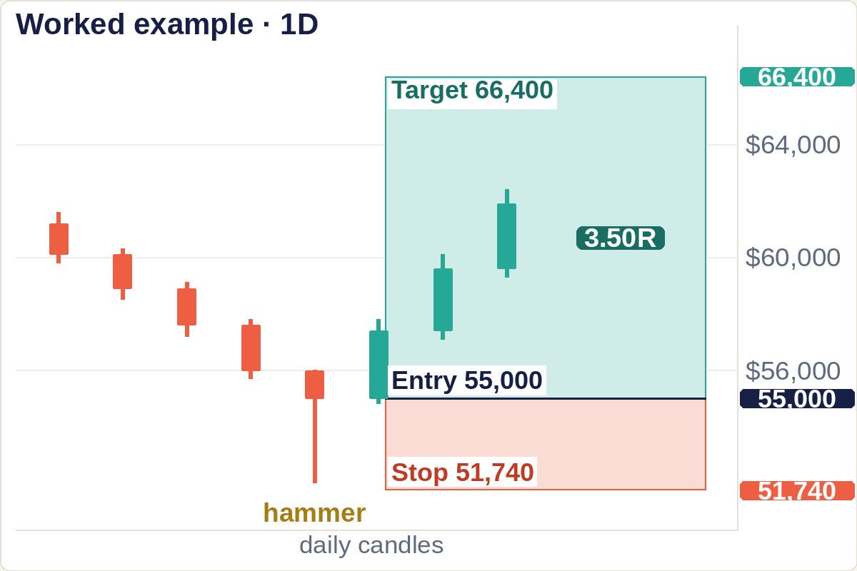
Return to the hammer from earlier: low $52,000, close $55,000, stop placed 0.5% under the low at $51,740, and the next resistance overhead at $66,400.
| Enter at the hammer's close | Wait for the confirmation candle | |
|---|---|---|
| Entry | $55,000 | $56,800 |
| Stop | $51,740 | $51,740 |
| Risk per unit | $3,260 | $5,060 — 55.2% wider |
| Reward to $66,400 | $11,400 | $9,600 |
| Reward-to-risk | 3.50R | 1.90R |
| Win rate needed to break even | 22.2% | 34.5% |
The last row is the one that matters, and it comes from a single line of algebra: a trade at R reward-to-risk breaks even at a win rate of 1 ÷ (R + 1). Confirmation drops you from 3.50R to 1.90R, which lifts your break-even win rate from 22.2% to 34.5%.
So the honest question is not “should I wait for confirmation?” It is: does waiting improve my win rate by more than 12.3 percentage points? In this worked example it is a steep hurdle, and on real four-hour hammers, measured below, waiting did not clear it. On your market and your frame it might — a beginner trading unconfirmed hammers into an accelerating fall is catching falling knives, and confirmation keeps some of those out. But it is now a question with a number attached, which is the point. You can settle it from your own records instead of from a rule someone handed you.
What did waiting actually buy on real hammers?
I ran that question on real candles too. Every four-hour candle on BTC, ETH and SOL from 2020 to September 2026 with a lower wick at least twice its body, a close in the top third of its range, only a small upper wick, and a low that was the lowest of the previous 20 candles: 289 hammers. Stop 0.5% under the hammer’s low, target at the nearest swing high already on the chart, same win rules as the engulfing test above.
| Enter at the hammer’s close | Wait: next candle closes green above the hammer’s high | Any candle at a 20-candle low, hammer or not | |
|---|---|---|---|
| Trades | 288 | 86 (30% of hammers confirmed) | 3,541 |
| Median reward-to-risk | 1.46R | 0.97R | 2.55R |
| Won | 43.4% | 48.8% | 33.4% |
| Needed to break even | 46.6% | 52.4% | 34.4% |
| Average per trade, before fees | −0.04R | −0.01R | −0.01R |
There are two ways to read that table, and they give different answers. As a filter — only taking hammers that confirm, instead of taking every hammer — confirmation lifted the win rate by 5.4 points and raised the bar by 5.8. It screened out about as many winners as losers. A wash.
As a delay it was worse. On the same 86 hammers that did confirm, entering at the hammer’s own close would have won 50.0% of the time against 38.6% needed and averaged +0.43R. Waiting for the confirming close raised the bar to 52.4% — a 13.8-point jump, more than the 12.3 of the worked example — and bought nothing: the win rate went to 48.8%, the average to −0.01R. The confirmation candle was the profit, and waiting is how you pay it away. (You cannot know in advance which hammers will confirm, which is why entering all 288 early averaged −0.04R.)
Look at the right-hand column too. A plain candle that made a 20-candle low did no worse than the hammers — and no better, since it lost a little too (−0.01R before fees, −0.08R after 0.1%). In this sample the hammer shape added nothing measurable over the location, and the location alone was not an edge either. The daily chart has only 37 such hammers, too few to say anything.

Why does the same shape mean opposite things on different volume?
Because the shape tells you the result of the fight and the volume tells you whether there was a fight at all.
Read a doji with that in mind. The candle opened and closed at nearly the same price, so the session went nowhere. Two completely different things can produce it:
- Heavy volume, tiny body. A great deal was bought and a great deal was sold, and the two cancelled out. Somebody with size was absorbing everything the other side could throw. That is a genuine standoff, and standoffs at the end of a trend are how trends end.
- Light volume, tiny body. Nothing happened. Nobody was there. Price drifted because there was no reason for it to do anything else — a quiet weekend hour, not a turning point.
Identical candle. Opposite information. This is the principle Lesson 14 calls effort versus result: heavy effort producing no movement means someone was pushing back, while light effort producing no movement means nobody was pushing at all. It applies to every pattern in the table above, and it is the single cheapest filter available — the volume bar is already on your screen, directly under the candle you are staring at.
Volume is not the only filter, and it is not the strictest one. Where momentum sits when the pattern prints is a second screen entirely: one school discards any reversal pattern that forms while RSI is still stuck inside the 40–60 band, on the grounds that a market with no pressure behind it has nothing to reverse. That is one school’s threshold rather than a law — but it is a free second opinion on a pattern you were about to trade.
One warning that catches almost everyone, because the chart is actively misleading here: a green volume bar does not mean buying volume. Volume bars simply copy the colour of their candle. Every trade has a buyer and a seller in equal measure; there is no such thing as a bar of purely buy volume. What you can read is the relationship — large volume with a small body means both sides were present in size.

How do you run the check, in order?
Four passes, always the same way round, and the order is not cosmetic — each step can kill the setup, so the cheapest checks go first.
- Where is it? Scroll left. Was the market falling into this candle, or rising, or going nowhere? If you cannot answer, stop — you cannot even name the pattern yet, since a hammer and a hanging man are the same candle in different places.
- Measure the wick against the body. Two to one at minimum. If you have to measure it twice, it is not one; the compression table above says the difference you are agonising over is about four percentage points.
- Look at the volume bar underneath. Small body with heavy volume is an absorption. Small body with light volume is an empty hour wearing the same costume.
- Price it before you believe it. Mark the stop at the pattern extreme and the target at the next structure, then compute D ÷ h − 1. Under 2, walk away — however good the pattern looks. That floor is one school’s rule, not an edge in itself (section 5b shows 2R-plus engulfings won only as often as they needed to); what it does is fix the win rate you have to beat at one in three.
The same pricing logic scales straight up to the multi-candle shapes. Double tops and head and shoulders are priced by exactly this method, and it produces a result almost nobody quotes: the textbook double top is fixed at 1.00R by geometry, whatever the market.
Step 4 is the one that gets skipped, and it is the only step that can save a trade where steps 1 to 3 all passed. A perfect pattern with 0.8R on it has to win 55.6% of the time just to break even. The tallest engulfings in section 5b won 55.0% — break-even, not profit, and that is before fees.
There is a third size of window after the one-candle and two-candle families, and it behaves differently enough to be worth its own lesson. Lesson 27 covers the morning star, the evening star and the inside bar, and prices the candle count directly: holding the target fixed, moving from a one-candle signal to a three-candle one costs 7.9 percentage points of break-even win rate. That is the cheapest confirmation on this site — cheaper than the 12.3 points priced above. The expensive part turns out to be something else entirely.
When is everything above wrong?
Four situations, and they are common enough that you will meet all of them in a normal month.
On low timeframes, most of this dissolves. A pattern is a statement about a crowd making a decision, and on a one-minute chart there is no crowd — there is a handful of orders and a market maker. The shapes still form, they just are not recording anything. As a working rule these patterns start carrying information around the 1-hour and get more reliable up through the 4-hour and daily; below the 1-hour, treat them as decoration. That threshold is a rule of thumb; we have not measured it.
In a strong trend, continuation beats reversal. Reversal patterns fire constantly inside trends and mostly fail, because a trend is precisely a market where one side keeps finding more money. A hammer in a downtrend that is still accelerating is not a bottom; it is a pause. This is where checking the frame above earns its keep — a reversal pattern facing a higher frame that is still pushing the other way is a pattern trading against a bigger pool of money than it can see.
In crypto, the candle boundary is a convention rather than an event. A daily candle in a stock market closes when the exchange closes and positions are settled — a real moment where real decisions are forced. Crypto never closes, so a “daily” candle ends whenever your charting software says it does, commonly midnight UTC but shifting with your timezone setting. As of August 2026, two traders looking at the same asset can see genuinely different daily candles, and a doji on one screen can be an ordinary green candle on the other. Fix your chart's timezone, leave it fixed, and be sceptical of any single-candle pattern on the exact frame where that boundary falls.
And when the location, not the pattern, is doing whatever work gets done. On 289 real four-hour hammers, a plain candle at the same 20-candle low did as well as the hammer did. If your hammers seem to work, check that it is not simply the lows working: note a few plain candles at the same kind of low in your journal, trade them on paper, and compare. If the plain ones keep up, the shape is not what you are paying for — and in our sample neither the shape nor the plain low made money on its own, so the edge, if you have one, lives in whatever else you are checking.
What are the most common mistakes here?
- Naming the pattern before locating it. The hammer and the hanging man are the same candle; so are the shooting star and the inverted hammer. Half the pattern's meaning is the trend it interrupted, and that half is not in the shape.
- Grading borderline shapes. If you are measuring a wick twice, you are arguing over roughly four percentage points of recovery. Take the obvious ones.
- Treating pattern size as strength. It is stop width. R:R = D ÷ h − 1, and the dramatic candle usually scores worst on it.
- Reading a doji without its volume bar. Heavy volume means absorption; light volume means an empty hour. Same shape, opposite conclusion.
- Waiting for confirmation on reflex. It costs about half your R:R in this worked example and needs to add 12.3 points of win rate to pay for itself. Sometimes it does. Check, do not assume.
- Trading patterns below the 1-hour. There is no crowd down there for the pattern to be a record of.
- Treating the 2R floor as the edge. On 1,057 real engulfings the ones priced above 2R won only as often as they needed to break even. The floor chooses the win rate you need; the edge has to come from the location, the volume or the frame above.
- Collecting patterns instead of using four. Knowing forty names does not help. Knowing where the stop goes does.
What else do people ask about candlestick patterns?
How reliable are candlestick patterns really?
Reliable enough to be worth measuring and nowhere near reliable enough to trade on their own. Published hit rates vary enormously with how the pattern was defined, which market and period were tested, and what counted as a win — a fixed target and a trailing stop report wildly different numbers for the identical pattern. So we measured one version ourselves: 1,057 four-hour engulfings on BTC, ETH and SOL from 2020 to 2026, stop at the pattern extreme and target at the nearest earlier swing. The win rate landed within three points of the break-even rate for the R:R in every group, and the average result sat within noise of zero before fees and below it after them. That is why this lesson gives you break-even arithmetic instead of a hit rate: at 3.50R you need 22.2% to break even and at 1.90R you need 34.5%, whoever’s study you believe. Work out your own rate from your own records, then compare it to the break-even for the R:R you are actually getting.
Which single pattern should a beginner learn first?
The engulfing pair, because it is the only one on the list where you cannot fool yourself about whether it happened. Either candle 2's body completely covers candle 1's body or it does not — there is no borderline, no ratio to squint at, no judgement call. Everything else on the table has a threshold you can quietly relax when you want a trade. Learn engulfing properly, including where the stop goes and how to price it, and you will have the whole method in miniature; the other patterns are then variations you can add one at a time.
Do candlestick patterns work in crypto the same way they do in stocks?
The mechanism carries over; the candle boundary does not. Patterns work because they record a crowd changing its mind, and crypto has plenty of crowd. What crypto lacks is a session close, so the daily candle is defined by your charting software rather than by an event where positions are settled — commonly midnight UTC as of August 2026, but it moves with your timezone setting. The practical effect is that single-candle patterns on the daily are slightly less trustworthy in crypto than in a market with a real close, while two- and three-candle patterns like engulfing and morning star hold up better, since they do not depend on exactly where one boundary landed.
Should I use candlestick patterns for entries or for exits?
Entries, mostly — and the reason is the arithmetic in this lesson rather than anything about the patterns themselves. An entry gives the pattern a job it is good at: it supplies a stop level, which lets you size the position and compute reward-to-risk before you commit. An exit signal has no such structure. A shooting star while you are long says “buyers just failed”, which might mean get out, or might mean a pullback inside a move you wanted to hold for another week. Without a stop to anchor it, you are left trading a feeling. If you do want a pattern-based exit, tie it to something measurable — for example, close the position if a bearish engulfing forms and price closes back under the level you entered above.
Keep the whole course next to your charts
The whole slide course — ten free PDF parts, 351 pages, taught on real charts.