Part 2 — Scaling, market cycles and indicators
Scale in and out, bull-bear-sideways cycles, market structure, RSI, moving averages and volume. All 43 slides in the order the course teaches them — each one explained underneath.
Scale IN/Scale OUT — Market trend. Technical indicators. PART II.
Slide 1 of 43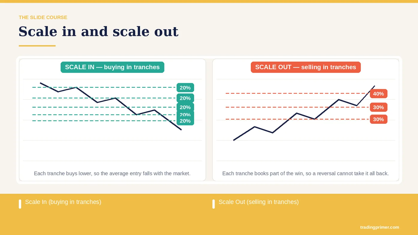
Scale in — Scale out. Entering this way keeps a trader from going all-in on a single order, avoids trying to catch the exact bottom, and gets you filled at the best prices available. How to enter: in 20/20/20/20/20 tranches — Scale in. This is how you scale out of a position as the market keeps pushing higher. It lets a trader squeeze the most out of the move while avoiding the wide, violent sell-offs that turn good earlier entries into losing ones. Scale In (buying in tranches). Scale Out (selling in tranches). Applying it in trading. Buy And Hold.
Slide 2 of 43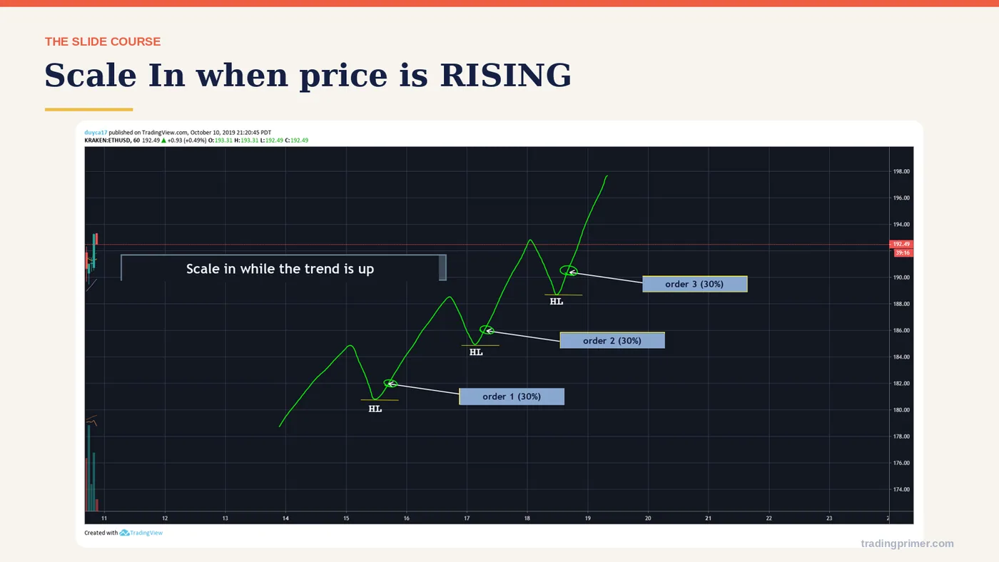
Scale In when price is RISING — The chart carries the detail; the markings on it are what the course is teaching here.
Slide 3 of 43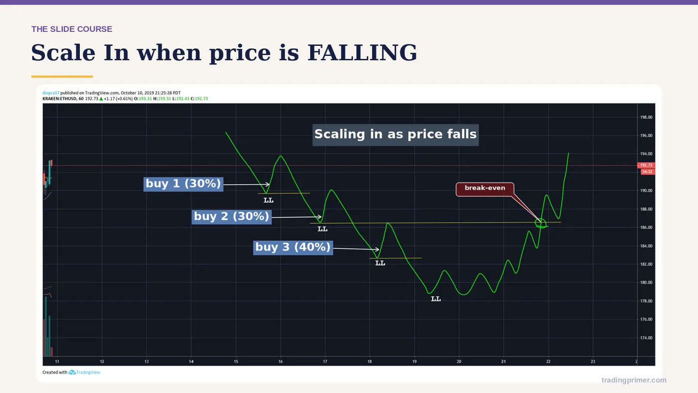
Scale In when price is FALLING — The chart carries the detail; the markings on it are what the course is teaching here.
Slide 4 of 43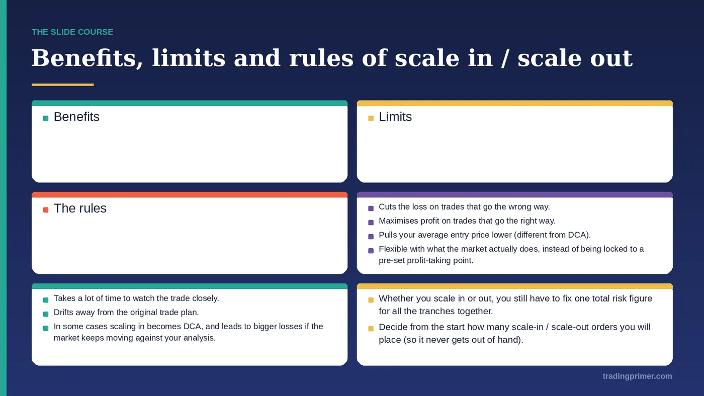
Benefits, limits and rules of scale in / scale out — Cuts the loss on trades that go the wrong way. Maximises profit on trades that go the right way. Pulls your average entry price lower (different from DCA). Flexible with what the market actually does, instead of being locked to a pre-set profit-taking point. Benefits. Takes a lot of time to watch the trade closely. Drifts away from the original trade plan. In some cases scaling in becomes DCA, and leads to bigger losses if the market keeps moving against your analysis. Limits. Whether you scale in or out, you still have to fix one total risk…
Slide 5 of 43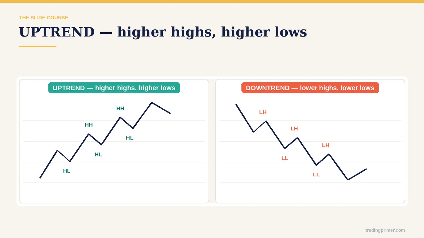
Market trend — The chart carries the detail; the markings on it are what the course is teaching here.
Slide 6 of 43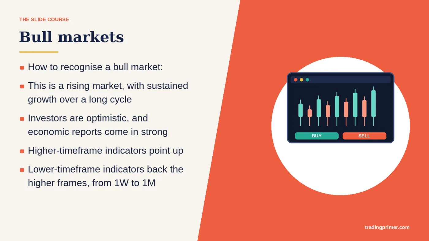
This is a rising market, with sustained growth over a long cycle — Investors are optimistic, and economic reports come in strong. Higher-timeframe indicators point up. Lower-timeframe indicators back the higher frames, from 1W to 1M. Bull markets. How to recognise a bull market:
Slide 7 of 43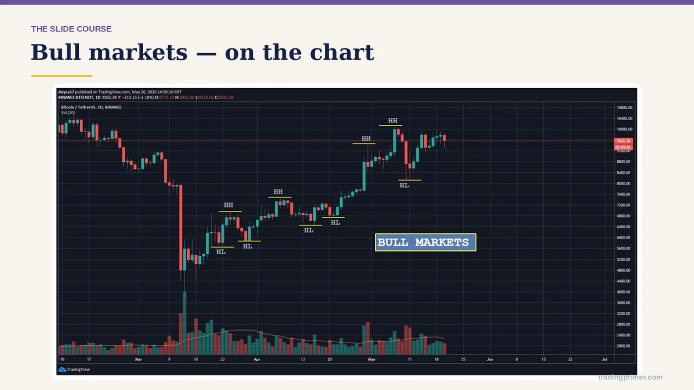
Market trend — a chart from the course deck. The markings on it are the lesson; read them left to right.
Slide 8 of 43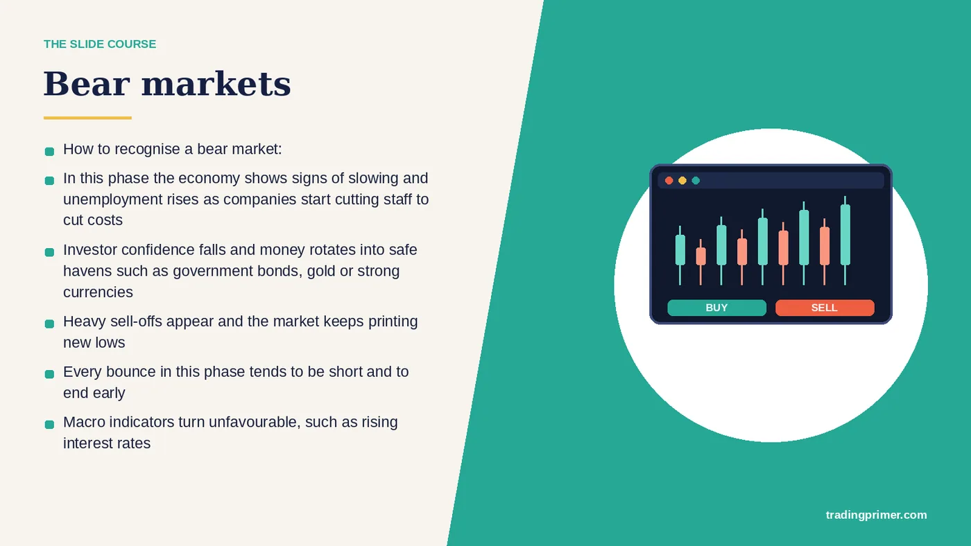
In this phase the economy shows signs of slowing and unemployment rises as companies start cutting staff to cut costs — Investor confidence falls and money rotates into safe havens such as government bonds, gold or strong currencies. Heavy sell-offs appear and the market keeps printing new lows. Every bounce in this phase tends to be short and to end early. Macro indicators turn unfavourable, such as rising interest rates. Indicators point down from the higher frames, 1M to 1W. Bear markets. How to recognise a bear market:
Slide 9 of 43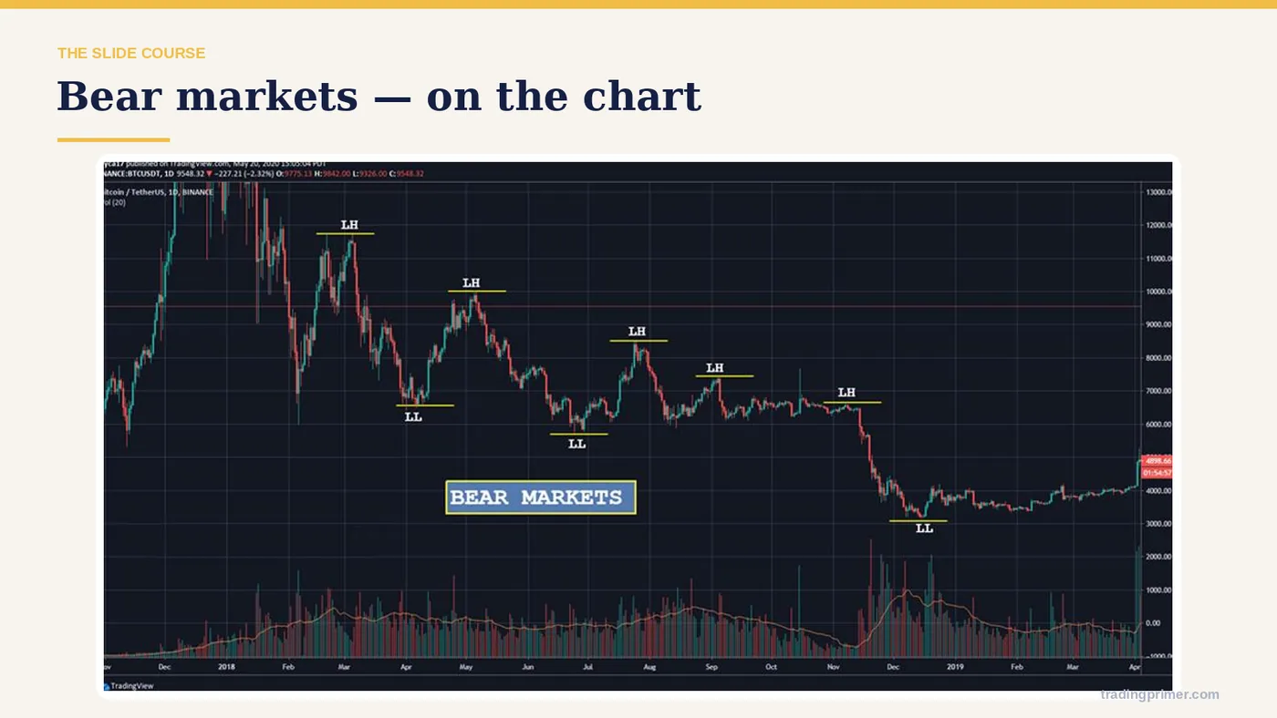
Market trend — a chart from the course deck. The markings on it are the lesson; read them left to right.
Slide 10 of 43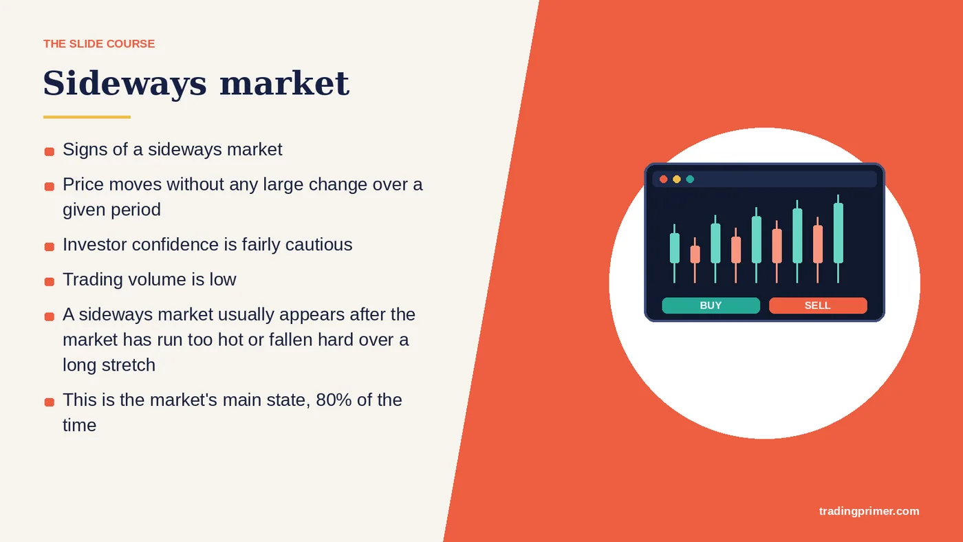
Price moves without any large change over a given period — Investor confidence is fairly cautious. Trading volume is low. A sideways market usually appears after the market has run too hot or fallen hard over a long stretch. This is the market's main state, 80% of the time. Sideways market. Signs of a sideways market.
Slide 11 of 43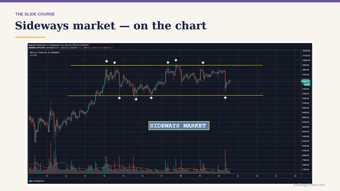
Price moves without any large change over a given period Investor confidence is fairly cau — a chart from the course deck. The markings on it are the lesson; read them left to right.
Slide 12 of 43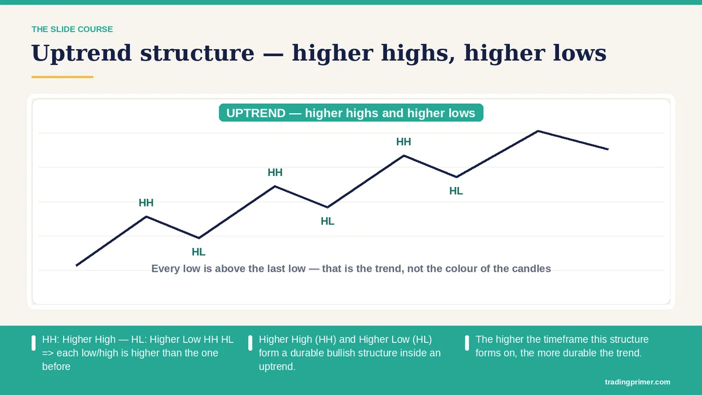
What are HH and HL? — HH: Higher HighHL: Higher LowHH HL => each low/high is higher than the one before. Higher High (HH) and Higher Low (HL) form a durable bullish structure inside an uptrend. The higher the timeframe this structure forms on, the more durable the trend.
Slide 13 of 43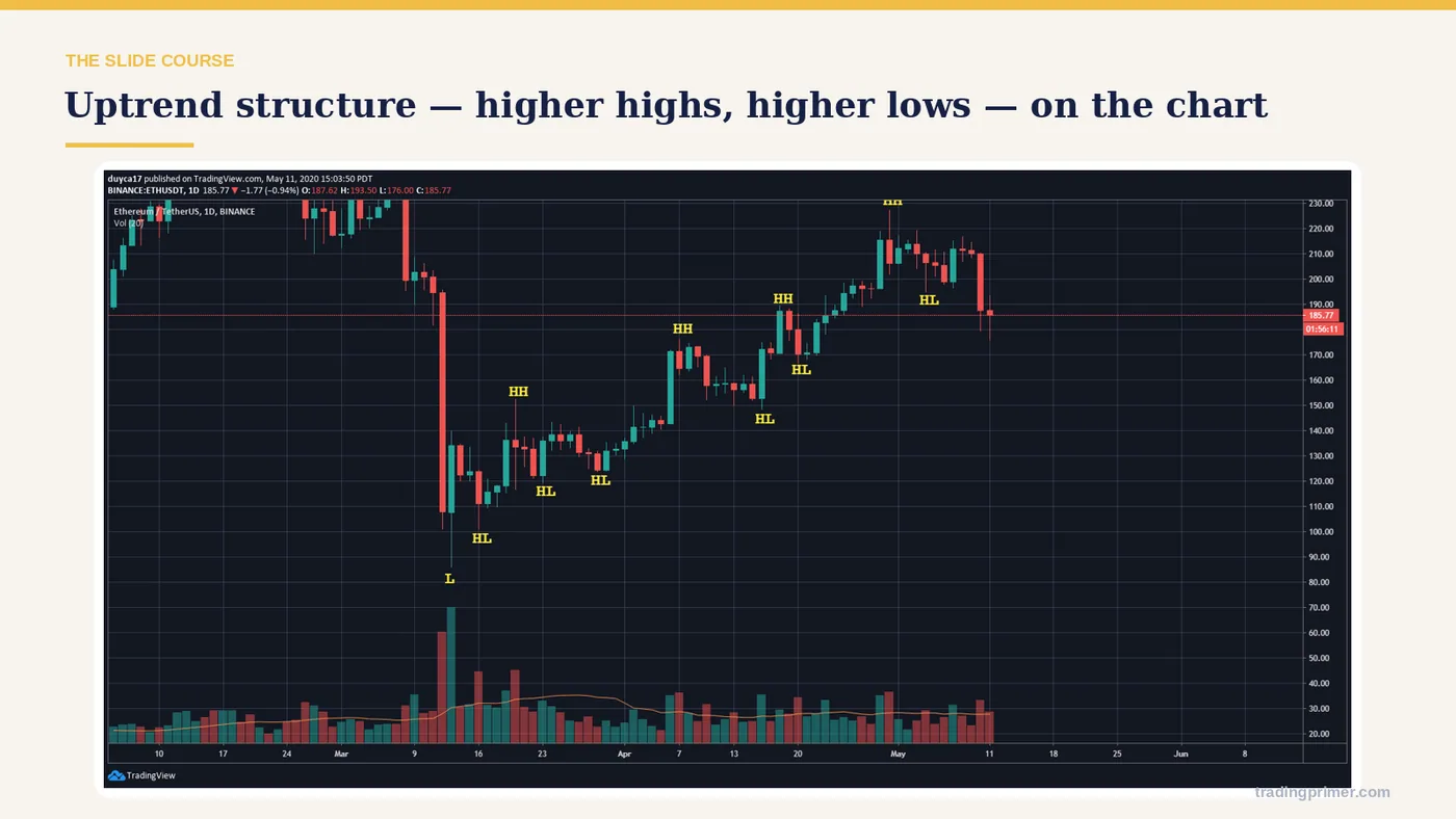
What are HH and HL? — a chart from the course deck. The markings on it are the lesson; read them left to right.
Slide 14 of 43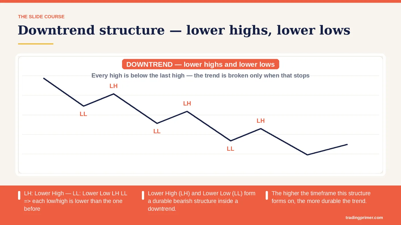
What are LL and LH? — LH: Lower HighLL: Lower LowLH LL => each low/high is lower than the one before. Lower High (LH) and Lower Low (LL) form a durable bearish structure inside a downtrend. The higher the timeframe this structure forms on, the more durable the trend.
Slide 15 of 43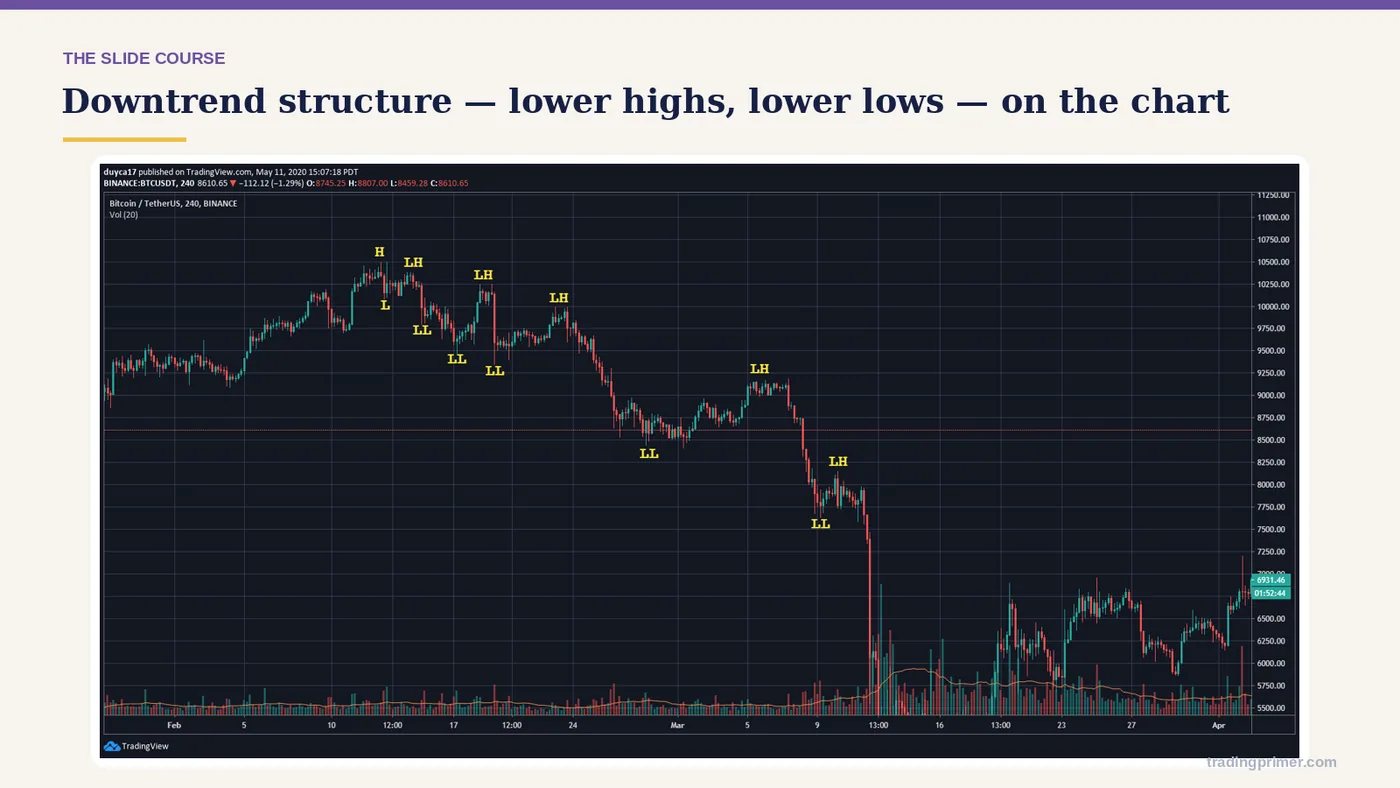
What are LL and LH? — a chart from the course deck. The markings on it are the lesson; read them left to right.
Slide 16 of 43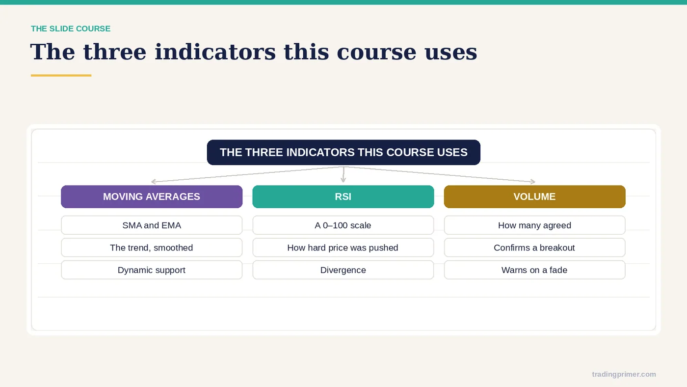
Indicators — VOLUME. MOVING AVERAGES. (SMA, EMA).
Slide 17 of 43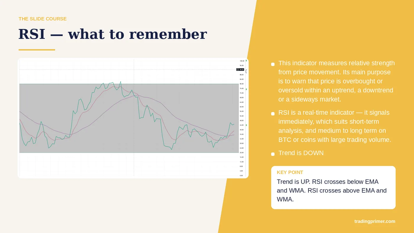
RSI — what to remember — This indicator measures relative strength from price movement. Its main purpose is to warn that price is overbought or oversold within an uptrend, a downtrend or a sideways market. RSI is a real-time indicator — it signals immediately, which suits short-term analysis, and medium to long term on BTC or coins with large trading volume. RSI crosses above EMA and WMA. Trend is UP. DOWN. RSI crosses below EMA and WMA. Trend is DOWN.
Slide 18 of 43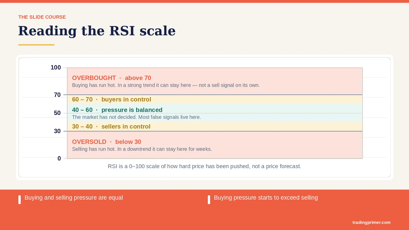
40 < RSI < 60 — Buying and selling pressure are equal. RSI > 60. Buying pressure starts to exceed selling. RSI < 40. Selling pressure starts to exceed buying. RSI > 70. Buying pressure starts to far exceed selling. RSI < 30. Selling pressure starts to far exceed buying. RSI > 80. Bullish inertia — buying pressure overwhelms selling. RSI < 20. Bearish inertia — selling pressure overwhelms buying.
Slide 19 of 43
40 < RSI < 60 — a chart from the course deck. The markings on it are the lesson; read them left to right.
Slide 20 of 43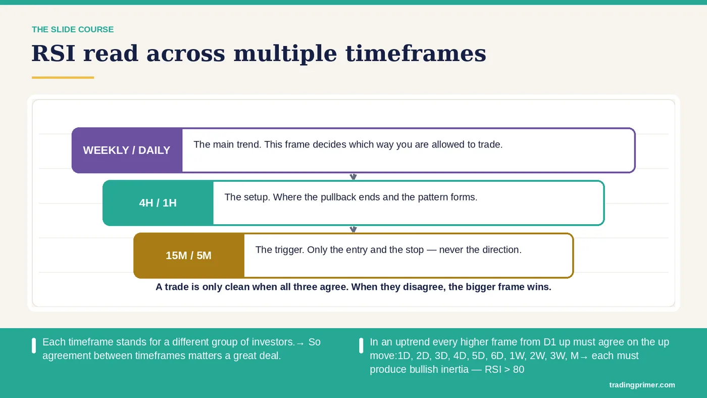
RSI read across multiple timeframes — ★ Each timeframe stands for a different group of investors.→ So agreement between timeframes matters a great deal. ★ In an uptrend every higher frame from D1 up must agree on the up move:1D, 2D, 3D, 4D, 5D, 6D, 1W, 2W, 3W, M→ each must produce bullish inertia — RSI > 80. ★ The nature of waves. The higher timeframe decides the market's main trend. The lower timeframe is the market's catalyst. For a wave to run it needs agreement and permission from the higher frame, and support from the lower one. A wave on any frame has to respect the support…
Slide 21 of 43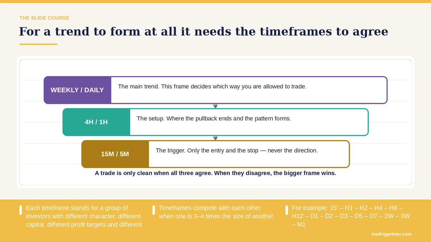
Each timeframe stands for a group of investors with different character, different capital, different profit targets and different entry and exit points.→ That is what puts the timeframes out of phase — each group decides differently. Sometimes they agree, sometimes they do not. — For a trend to form at all it needs the timeframes to agree. Timeframes compete with each other when one is 3–4 times the size of another. For example: 15' – H1 – H2 – H4 – H8 – H12 – D1 – D2 – D3 – D5 – D7 – 2W – 3W – M1.
Slide 22 of 43
Wave progression theory — The chart carries the detail; the markings on it are what the course is teaching here.
Slide 23 of 43
Wave progression theory — a chart from the course deck. The markings on it are the lesson; read them left to right.
Slide 24 of 43
Three meaningful points in an RSI trend — The chart carries the detail; the markings on it are what the course is teaching here.
Slide 25 of 43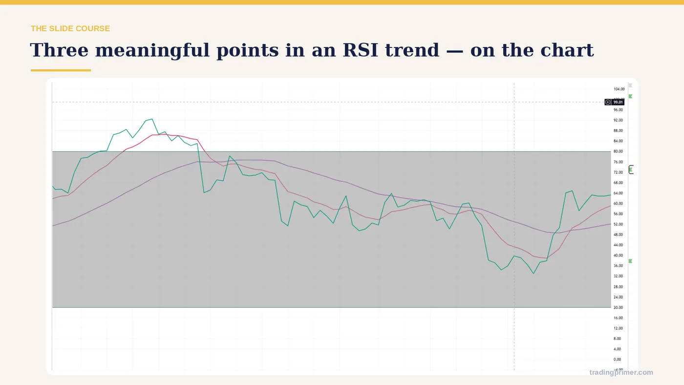
1 — The chart carries the detail; the markings on it are what the course is teaching here.
Slide 26 of 43
The four stages of bullish inertia — The main wave forms; RSI shows its trend through how far and how steeply it spreads from the two averages. Stage 1. Bullish inertia forms. RSI > 80. At this point we judge the rise to be strong and to be overwhelming the sellers, and we expect that after this wave's correction there will be a wave completing the inertia at or above this wave's high. Stage 2. RSI cuts down into a correction. Stage 3. Bullish inertia completes. The waves that complete the inertia are the data for judging whether the trend is about to weaken. If the completing…
Slide 27 of 43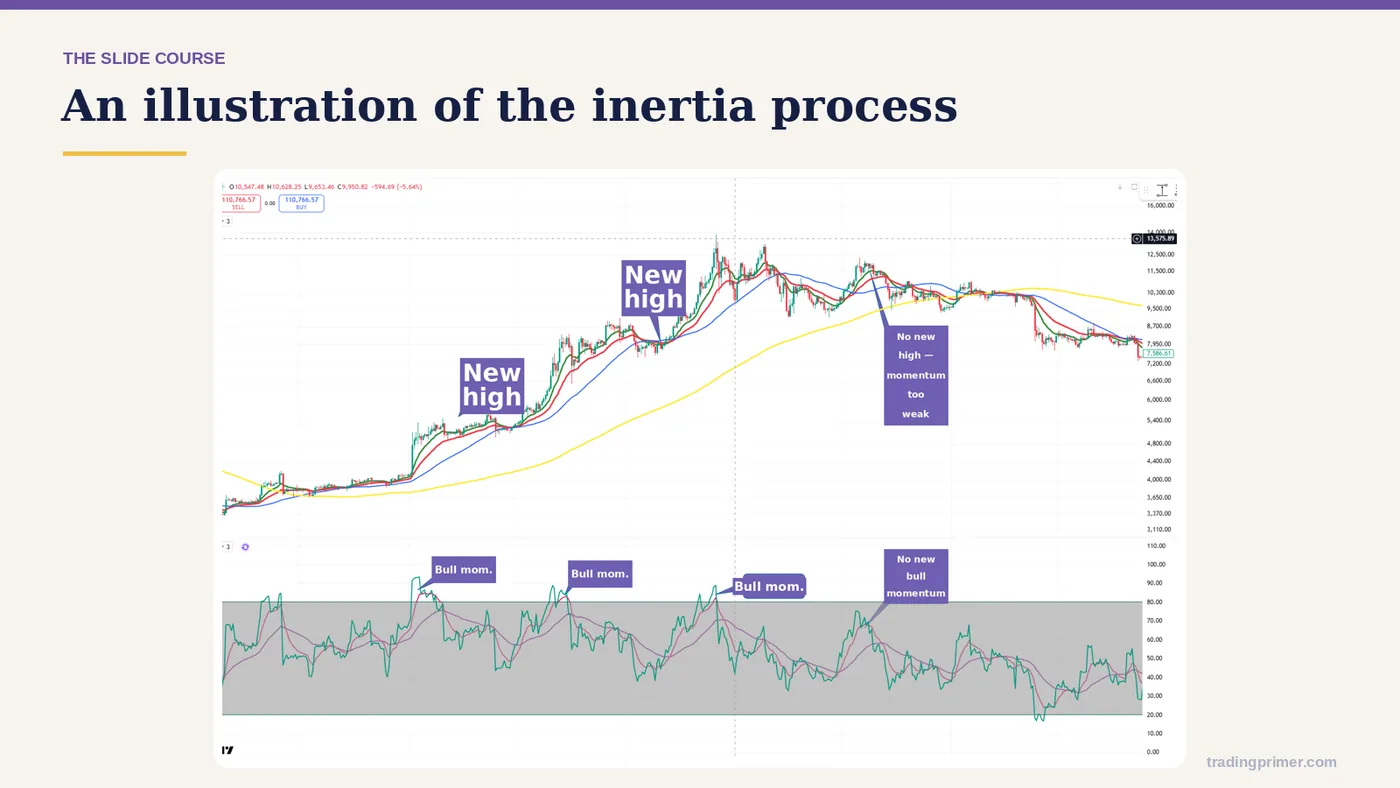
An illustration of the inertia process — The chart carries the detail; the markings on it are what the course is teaching here.
Slide 28 of 43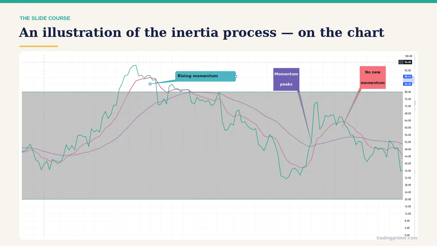
1 — a chart from the course deck. The markings on it are the lesson; read them left to right.
Slide 29 of 43
Wave 4 has two cases — Tests the high, then corrects. Breaks the high, and RSI keeps building inertia so the strong wave continues. If RSI corrects too deep in wave 3, below 40 → wave 4 usually weakens and only 'tests the high'. The same in a down wave: RSI > 60 → it usually only tests the low.
Slide 30 of 43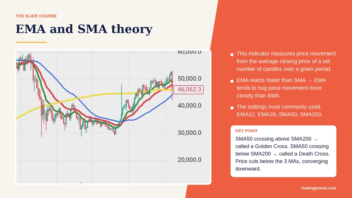
EMA and SMA theory — This indicator measures price movement from the average closing price of a set number of candles over a given period. EMA reacts faster than SMA → EMA tends to hug price movement more closely than SMA. The settings most commonly used: EMA12, EMA26, SMA50, SMA200. SMA50 crossing above SMA200 → called a Golden Cross. SMA50 crossing below SMA200 → called a Death Cross. Price cuts above. the 3 MAs, converging upward. Price cuts below. the 3 MAs, converging downward. DOWN.
Slide 31 of 43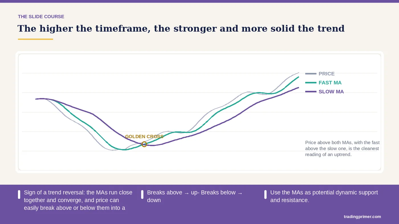
Sign of a trend reversal: the MAs run close together and converge, and price can easily break above or below them into a new trend. — - Breaks above → up- Breaks below → down. The higher the timeframe, the stronger and more solid the trend. Use the MAs as potential dynamic support and resistance. MA is a lagging indicator, suited to judging the long-term trend from D1 to W1, and to long-term analysis and long-term investment in altcoins. - Often use the D1 MA and above to find long-term reversal points on altcoins. - Often use the D1 MA to find the bottom on altcoins.
Slide 32 of 43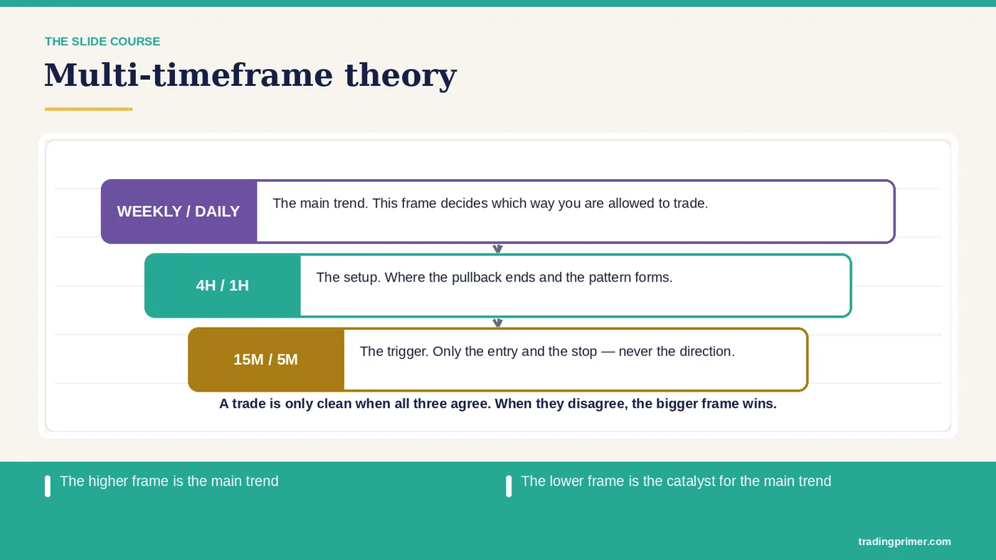
Multi-timeframe theory — The higher frame is the main trend. The lower frame is the catalyst for the main trend. Same as with RSI.
Slide 33 of 43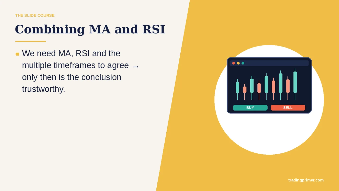
Combining MA and RSI — We need MA, RSI and the multiple timeframes to agree → only then is the conclusion trustworthy.
Slide 34 of 43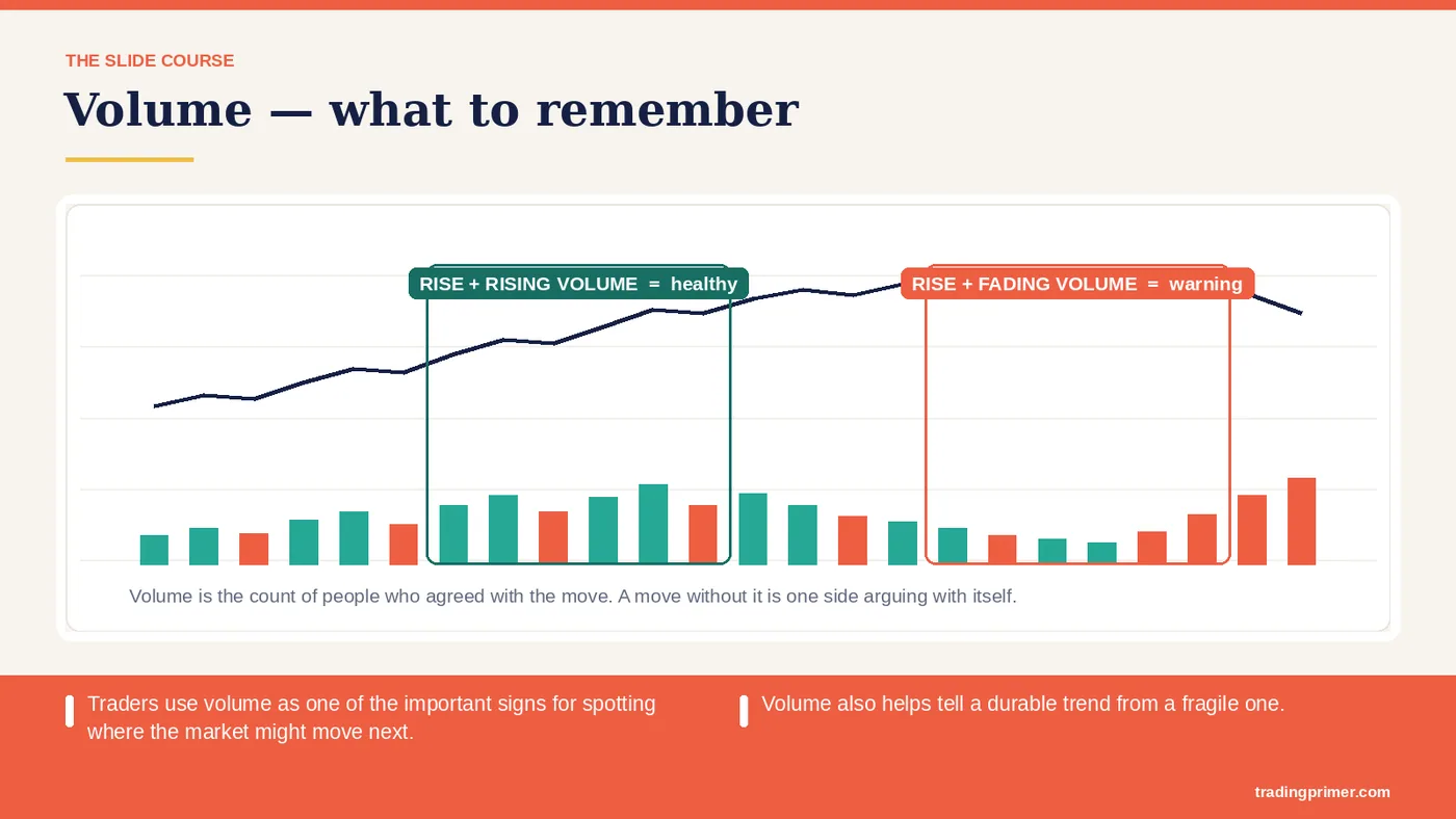
Volume — what to remember — Traders use volume as one of the important signs for spotting where the market might move next. Volume also helps tell a durable trend from a fragile one.
Slide 35 of 43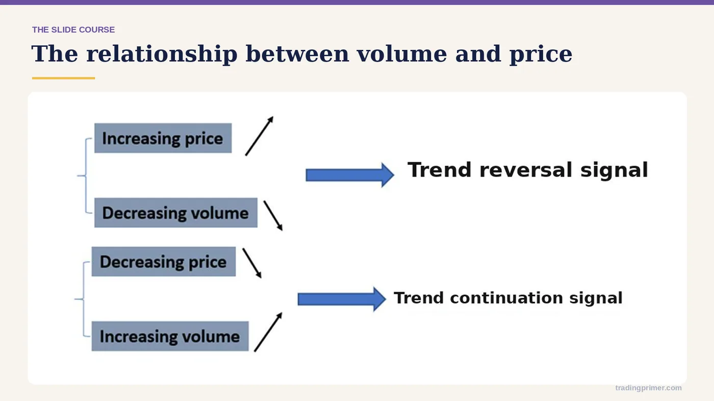
The relationship between — volume and price.
Slide 36 of 43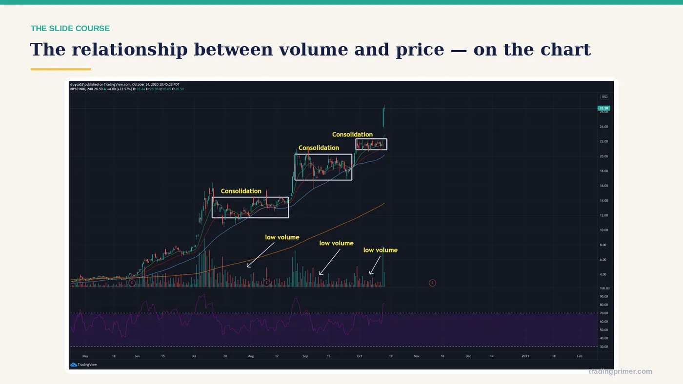
The relationship between volume and price — a chart from the course deck. The markings on it are the lesson; read them left to right.
Slide 37 of 43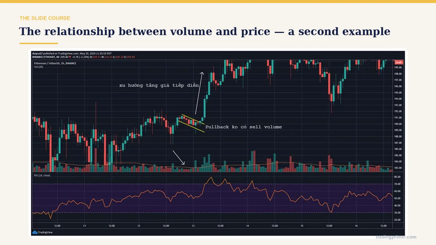
The relationship between volume and price — a chart from the course deck. The markings on it are the lesson; read them left to right.
Slide 38 of 43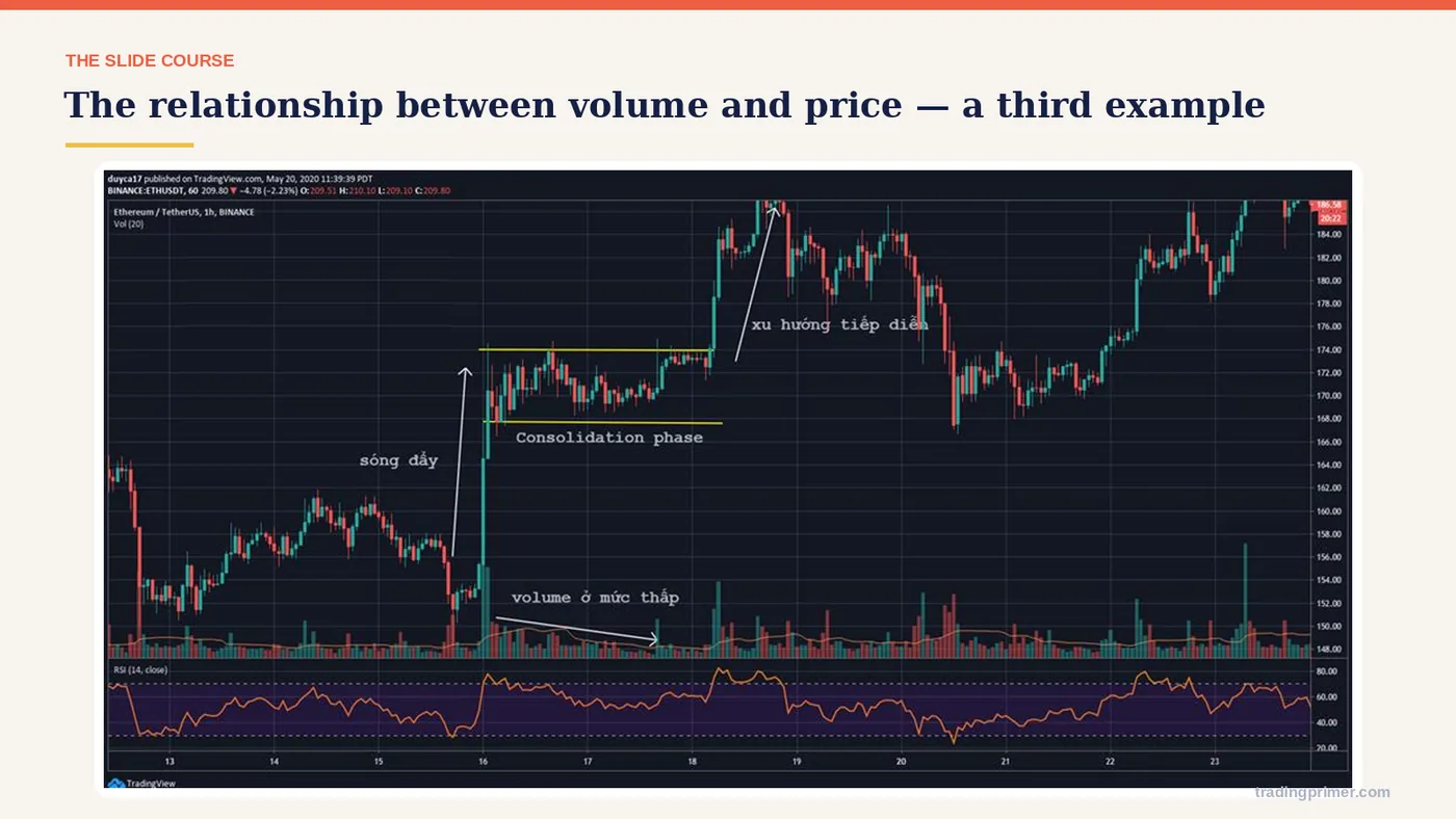
The relationship between volume and price — a chart from the course deck. The markings on it are the lesson; read them left to right.
Slide 39 of 43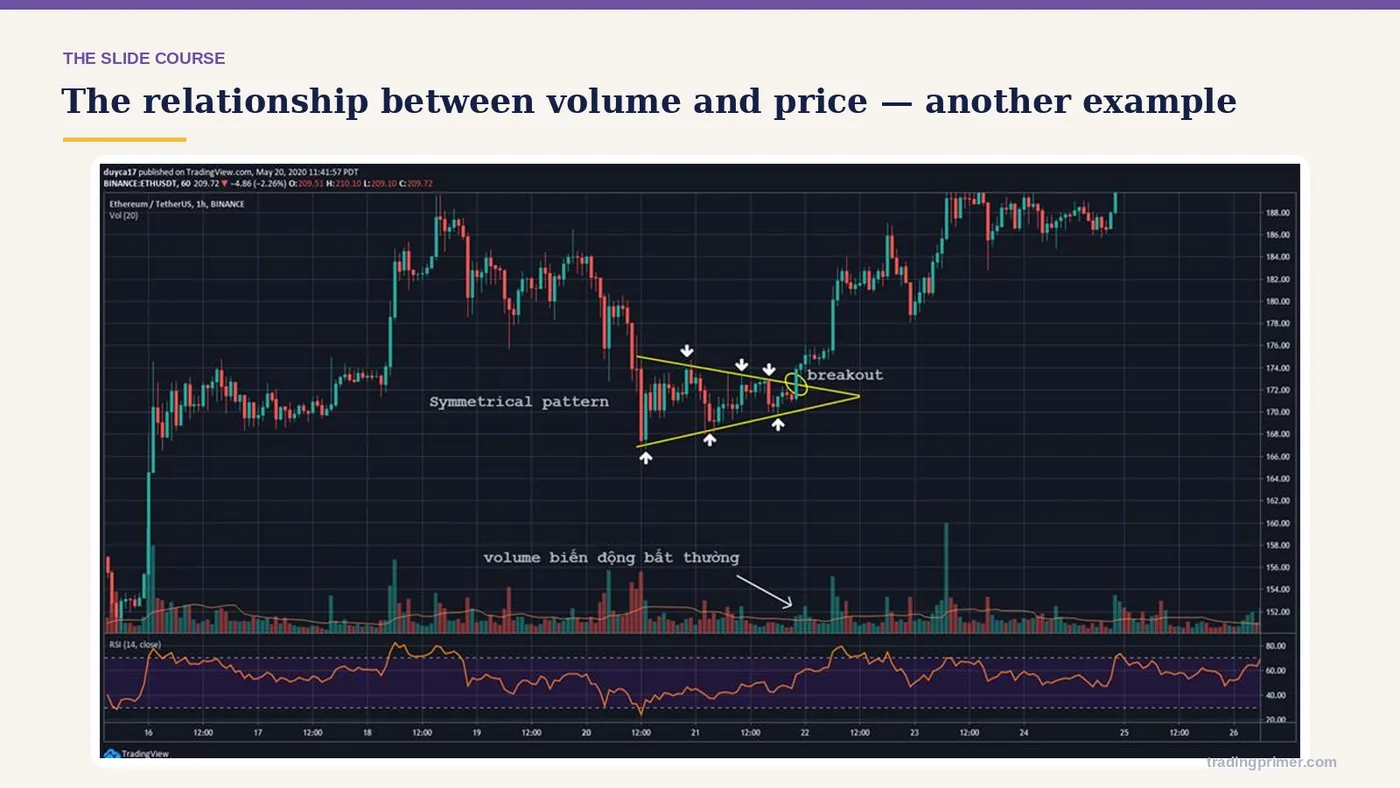
The relationship between volume and price — a chart from the course deck. The markings on it are the lesson; read them left to right.
Slide 40 of 43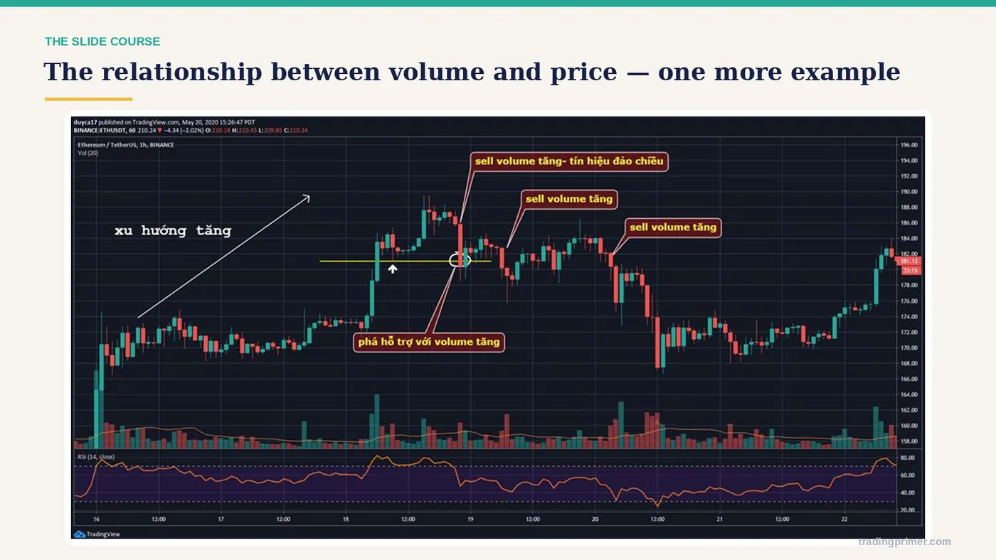
The relationship between volume and price — a chart from the course deck. The markings on it are the lesson; read them left to right.
Slide 41 of 43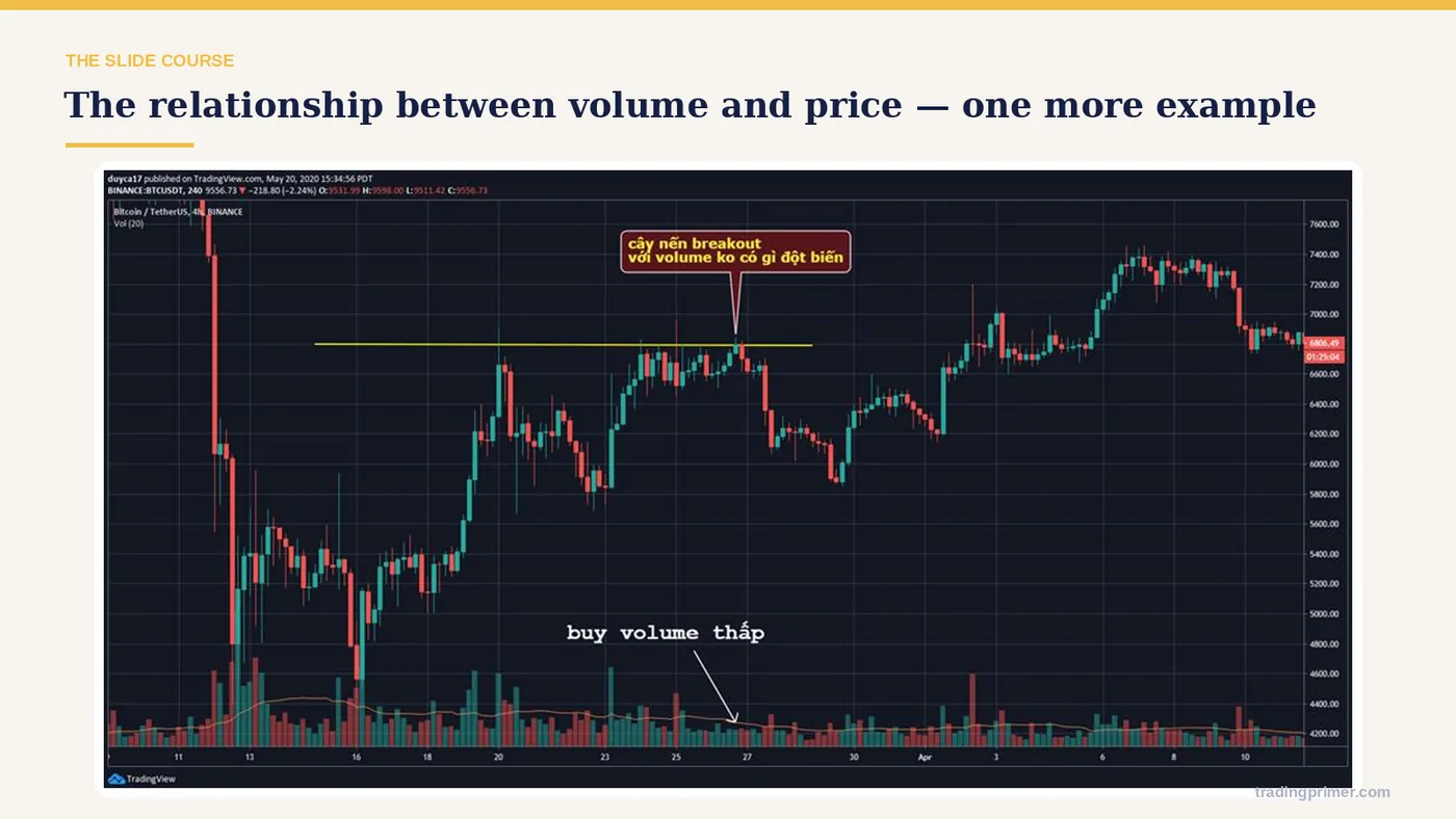
The relationship between volume and price — a chart from the course deck. The markings on it are the lesson; read them left to right.
Slide 42 of 43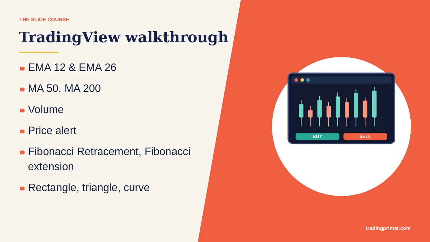
EMA 12 & EMA 26 — MA 50, MA 200. Volume. Price alert. Fibonacci Retracement, Fibonacci extension. Rectangle, triangle, curve. Long/short position for working out the R:R ratio. TradingView walkthrough. (youtube video).
Slide 43 of 43What this part covers
20 topics, in order. Each link jumps straight to that slide.
Prefer it as a PDF?
The same ten parts, downloadable, to keep next to your charts.